HTML Tooltip
What is HTML?
HTML is a common markup language used as a foundation of every webpage we see online. Thus, HTML is a markup language that is used by all web pages. HTML documents consist of tags that arrange and structure their content. This block is a basic block that is responsible for organizing the page and includes the layout elements, adding headers, paragraphs, links, pictures, and lists to the sites main content.
HTML tags are a secondary culprit that reveals the concept of HTML and sometimes the structure behind it, hence playing the role of the marquee tool. HTML web pages should be arranged in blocks, which include the nested into one other component that can be different - the content or some other feature. The sample HTML document containing one of the most basic metadata elements (like the title, character encoding, etc.) will be rather easy to write.
What is a Tooltip in HTML?
In HTML, a tooltip is a graphical user interface element that shows up when the user's pointer is over an interactive element, such as a button, link, or picture, on a webpage. It usually includes more details on the element, giving users background knowledge or instructions on how to utilize it. Tooltips show as a little pop-up box next to the element that is being hovered over and is intended to be quick and inconspicuous. By providing rapid, on-demand information without forcing the user to exit the current page or click on the element, they are frequently employed in web design to enhance the user experience.
Tooltips are frequently developed with JavaScript for interaction on top of HTML and CSS. Their appearance, including their size, color, and placement, can be altered to fit the website's general style better. Tooltips can also be used to give cautions or alerts, including letting users know that a form field is necessary or that a certain action would have a certain consequence. Tooltips are a beneficial tool for improving the accessibility and usability of online interfaces by giving users important information in an easy-to-understand format.
How to Make a Tooltip in HTML?
The "title" property in several HTML elements can be used to produce a tooltip. When a user moves their mouse over an element that has one, a little box with the title attribute's text will appear. This easy technique allows you to provide consumers with more context or information without making the UI cluttered. However, it's crucial to remember that these basic tooltip capabilities have stylistic and customization limitations.
You may utilize CSS and JavaScript to create more sophisticated tooltip features, such as dynamic behavior, interactive content, and custom styling. The tooltip box may be styled using CSS to alter its size, location, and look. JavaScript may provide interaction by adding animations and displaying or concealing tooltips in response to user input. Additionally, there are a tonne of tools and frameworks out there that offer more sophisticated tooltip capabilities, enabling you to make tooltips that are more interactive and aesthetically pleasing.
Example:
<!DOCTYPE html>
<html lang="en">
<head>
<meta charset="UTF-8">
<meta name="viewport" content="width=device-width, initial-scale=1.0">
<title>Tooltip Example</title>
<style>
/* Optional: Custom styles for the tooltip */
.tooltip {
position: relative;
display: inline-block;
}
.tooltip .tooltiptext {
visibility: hidden;
width: 120px;
background-color: black;
color: white;
text-align: center;
border-radius: 6px;
padding: 5px 0;
position: absolute;
z-index: 1;
bottom: 125%;
left: 50%;
margin-left: -60px;
opacity: 0;
transition: opacity 0.3s;
}
.tooltip: hover .tooltiptext {
visibility: visible;
opacity: 1;
}
</style>
</head>
<body>
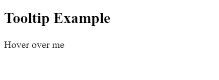
<h2>Tooltip Example</h2>
<div class="tooltip">Hover over me
<span class="tooltiptext">This is a tooltip</span>
</div>
</body>
</html>
Output:
The CSS styles set the tooltip's look and behavior. The tooltip container's position is set to relative by the tooltip class, which means that it will be positioned in relation to its regular location within the document flow. The tooltip itself is styled by the.tooltiptext class, which also sets its visibility to hidden by default and positions it exactly in relation to the div it contains. The tooltip is centered horizontally (left: 50%; margin-left: -60px); it has a black background, white text, and a border-radius of 6px. It is shown bottom: 125% from the top of the div.
How to Add Effects to Tooltips
Use CSS attributes like transition, opacity, and visibility to create effects on tooltips.
- Transition: To achieve seamless transitions when the tooltip appears or vanishes, use the transition attribute. This parameter specifies the kind and pace of the transition effect. To have the tooltip fade in and out over 0.3 seconds, for instance, use transition: opacity 0.3s;.
- Opacity: To make the tooltip invisible, set its initial opacity to 0. To make the tooltip completely visible when hovered over, set its opacity to 1. As a result, the fade-in effect is seamless.
- Visibility: To make the tooltip invisible at first, set its visibility to hidden. Set the visibility to visible to make the tooltip appear when the cursor is over it. By doing this, certainly, the tooltip will only appear once it is required.
By mixing these attributes and changing their values, you may add effects to your tooltips, including fading in and out, sliding in from the side, and growing/shrinking in size.
Tips for HTML Tooltips
To improve HTML tooltips' usability and efficacy, take into account the following advice:
- Keep it brief: Tooltips offer brief, extra information. Make sure the material is concise and direct.
- Make your wording clear: Make sure the tooltip text makes sense in the context in which it occurs and is easy to read.
- Refrain from clutter: Avoid packing your UI with an excessive number of tooltips. Employ them only when they truly bring value, and rarely.
- Be mindful of the timing: Choose a suitable time interval for the tooltip to show up after the element has been hovered over. While a delay that is too lengthy negates the purpose of a tooltip, one that is too short may be irritating.
- Think about accessibility: Ensure that users who rely on keyboard navigation or screen readers can view your tooltips. If needed, use ARIA attributes.
- Create with mobile devices in mind: Touch devices don't have hover events; thus, make sure tooltips are activated by touch events instead of thinking of other ways to provide the information.
- Test with many browsers: Make sure your tooltips appear appropriately and are functional by testing them on various devices and browsers.
These guidelines will help you make tooltips that are helpful to users without being intrusive or confusing.
Conclusion
HTML tips are an effective tool that makes the user interface neater and clearer. These tips are added on top of the links, and clicking on them gives visitors additional information without crowding the interface. Programmers can enhance usability and allow users to navigate their interface intuitively by correctly using the tooltips. To avoid tooltips interrupting the overall browsing experience and being rather annoying than useful, one must use them rationally, following practiced principles.
To summarize, tooltips' ease of use makes them a nearly ideal but sure choice of HTML elements that vastly increase users' web usage interface. With the right timing, simplicity, and clarity, tooltips could give users quick and relevant hints about the tool.