HTML Responsive
Overview of HTML responsive design
The idea behind responsive design in HTML is to adapt an HTML element to the size of the device for each screen size. These components should appear flawlessly on every tablet, laptop, or mobile device. An element that swiftly adjusts to the available space in the display view is known as responsive design. It is dependent on several aspects, including responsive images, text size, and viewport width. To perfectly match designs with various browsers and devices, responsive design incorporates a lot of innovative approaches these days. One of the finest features of flexible design using CSS is the use of media queries, which instruct the browser to change the size of the user's device.
Precursor of mobile web design, which is responsive design
Before responsive web design evolved as the industry standard for building websites that functioned on a types of devices, web developers occasionally referred to mobile web development, mobile web design, or even mobile-friendly design. These are essentially identical to responsive web design; the objective is to ensure that websites function properly in terms of layout, content (text and media), and performance on devices with varying physical characteristics (screen size, resolution).
The primary differences are associated with the devices in question and the technologies that may be utilized to deliver solutions:
- While there are now many other kinds of devices accessible, including desktops, laptops, mobile phones, tablets, watches, etc., we used to discuss desktop computers or mobile phones.
- These days, we have to build websites defensively to support typical screen sizes and resolutions together with unknowns, rather than just a few distinct screen sizes.
- In the past, mobile devices had minimal CPU/GPU and bandwidth capacities. Because some didn't support HTML or CSS at all, it was normal practice to utilize server-side browser sniffing to determine the sort of device or browser before delivering a website that the device could handle. Because that was all they could manage, mobile devices frequently had really basic, simplistic experiences provided to them. Such methods are becoming less frequent because mobile devices can already handle the same technology as desktop PCs.
- To develop responsive experiences, current technologies are far superior. For example, relevant media may now be supplied to different devices without the requirement for methods like server-side sniffing thanks to responsive image and media technologies.
HTML syntax design that responds
Several aspects affect responsive design in HTML; let's examine each one individually:
Setting Viewport: To assist the browser regulate the size and scale of the web page, the viewport may be set to the user page view using the syntax below. It will automatically modify components to fit various device sizes and adapt the display screen to the device.
<meta name="viewport" content="width=device-width, initial-scale=1.0">
Responsive images: When we upload photos to our website, we also need to make sure that they fit the screen size of every device correctly.
<div class='Description'> <img class='example' src='URL of image' /></div>
Set width property: We may make an element responsive on the screen display view by using CSS to set the width to 100%.
width: 100%;
Using the Max Width Property: This will let us show all of our HTML elements in the appropriate responsive format. Just as with the width, one may specify the max-width of the element to 100%.
Max- width: 100%;
Responsive Text: Just like with other elements, the text needs to adjust to the screen size of all devices. VW may be used to alter the viewport width, making it simple for the user to modify the text size to fit the device screen. This terminology clarifies why the browser display size is referred to as the viewport. In this case, one VW is equivalent to 1% of the viewport width.
<h2 style="font-size:3vw">Words</h2>
Using Media Queries: Text, pictures, and other components may be made more responsive for varying device sizes and browser widths by using media queries in responsive design. These days, a variety of frameworks are accessible to enhance the responsiveness of our website. They resemble:
- The responsive stylesheet framework facilitates the usage of several stylesheet frameworks such as W3.CSS which is essential for producing responsive designs. It supports mobile-first design by default. It is simple to pick up and grow in.
- Bootstrap is the most widely utilized framework with a fast growth rate and no cost to the user because it is built on web development languages like HTML, CSS and jQuery, which contribute to the responsiveness of websites and makes it easier for users to utilize than other frameworks.
- The most recent version of responsive CSS is compatible with a wide range of browsers and gadgets that includes laptops, tablets and smartphones.
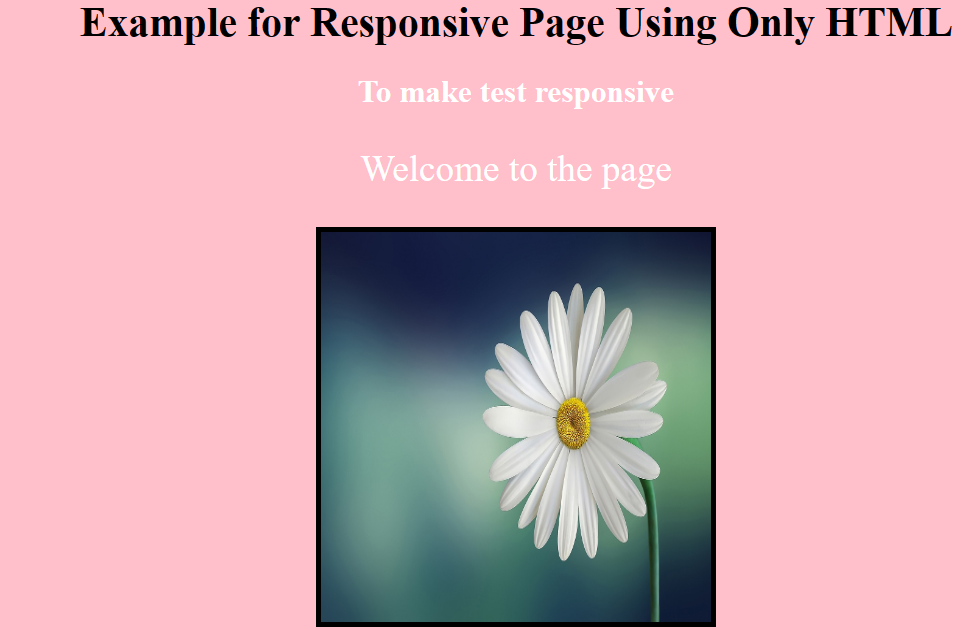
Demonstration 1:
We will construct a responsive website in this instance.
<html>

<head>

<meta name='viewport'

content='width=device-width, initial-scale=0'>

</head>

<body>

<div style="text-align: center;

background-color: pink;">

<h1 style="color: black;">

Example for Responsive Page Using Only HTML

</h1>

<h2 style="color: white;">

To make the test responsive

</h2>

<p style="font-size: 2vw;color: white;">

Welcome to the page

</p>

<picture>

<img src=

"Flower 1.jpg"

alt="Flower" width="300" height="300"

border="4">

</picture>

</div>

</body>

</html>
Output
Demonstration 2
This instance uses media queries to make the screen responsive. This will enable us to use code to create responsive webpages that work with a variety of browsers and devices:
<head>

<meta name="viewport" content="width=device-width, initial-scale=1.0">

<style>

* {

box-sizing:border-box;

}

.top {

background-color:lightblue;

padding:20px;

float:left;

width:30%;

}

.middle {

background-color:grey;

padding:20px;

float:left;

width:40%;

color:white;

}

.bottom {

background-color:pink;

padding:20px;

float:right;

width:30%;

}

@media screen and (max-width:500px) {

.top, .middle, .bottom {

width:50%;

}

}

</style>

</head>

<body>

<h2>Example for Responsive Design in HTML using Media Queries</h2>

<p>We can see the web page on different devices by resizing the browser window</p>

<div class="top">

<h4>First Part</h4>

<img src="Flower 1.jpg" width="300" height="300"

border="4">

</div>

<div class="middle">

<h4>Second Part</h4>

<img src="Flower 1.jpg" width="300" height="300"

border="4">

</div>

<div class="bottom">

<h4>Third part</h4>

<img src="Flower 1.jpg" width="300" height="300"

border="4">

</div>

</body>
Output
Content displaying or hiding
As a screen becomes smaller, items may be proportionately shrunk and components can be rearranged as needed to fit everything (relatively well). Although it's fantastic that this is feasible, it's not always the greatest solution to make all of the material from a large screen accessible on a smaller screen or mobile device. Best practices for mobile settings include less complicated navigation, information that is more targeted, and lists or rows rather than several columns of text.
The goal of responsive web design should go beyond simply building a layout that works across a variety of devices and screen sizes. The ability for the user to select what they want to see should also be a priority. Thankfully, CSS has made it simple for us to display and conceal content for many years!
For an HTML block element that has to be hidden in a certain style sheet, either specify display: none or use JavaScript to determine the browser width. Not only can we conceal material for smaller displays, but we can also conceal stuff for larger screens in our default style sheet that should only be accessible on mobile versions or smaller devices. For instance, as we conceal important sections of text, We may swap them out for an alternative navigation structure or with a link to that material.
We'll notice that we haven't used visibility: hidden in this instance; that attribute removes the information completely, whereas visibility: hidden only conceals it, even though it remains. The markup on the page should not be retained on smaller devices as it consumes resources and may lead to needless scrolling or disrupt the layout.
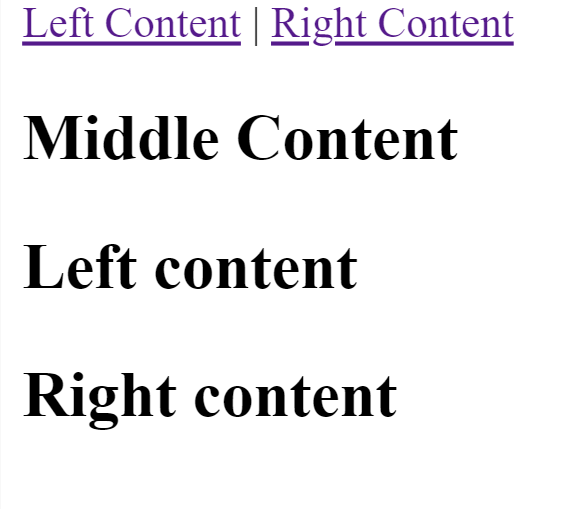
<html>

<p class="sidebar-nav"><a href="#">Left Content</a> | <a href="#">Right Content</a></p>

<div id="content">

  <h2>Middle Content</h2>

</div>

<div id="sidebar-left">

  <h2>Left content</h2>

</div>

<div id="sidebar-right">

  <h2>Right content</h2>

</div>

</html>
Output
 #content{
width: 50%;
float: left;
margin-right: 2%;
}
#content-left{
width: 10%;
float: left;
margin-right: 2%;
}
#content-right{
width: 10%;
float: left;
}
.sidebar-nav{display: none;}
Output
 This is the simplified *mobile.css* content:
#content{
width: 50%;
}
#content-left{
display: none;
}
#content-right{
display: none;
}
.sidebar-nav{display: inline;}
Output
 ← Prev
Next →
← Prev
Next →