HTML Table Alternate Row Color
The presentation of alternate-colored rows in HTML tables can contribute to increased readability and visual appeal. This technique produces a checkered pattern using another color and styling background color for every other row. You will make it easier to distinguish rows from one another, especially for users who deal with tables informatics large tables that are meant to accommodate a lot of data.
This approach can improve the overall customer experience, as well as contribute to higher visibility of the data within the table to lessen the perception of the table itself. This is normally done using CSS by checking even and odd rows and setting the background color for each of them in an isolated manner. This technique is often used in web applications to improve how tabled information is displayed.
Implementation
In an HTML table, you can use CSS to design the even and odd rows differently in order to create alternate row colors. Observe this simple example:
<!DOCTYPE html>

<html>

<head>

    <link rel="stylesheet" type="text/css" href="styles.css">

</head>

<body>

    <table>

        <tr>

            <th>Header 1</th>

            <th>Header 2</th>

            <th>Header 3</th>

        </tr>

        <tr>

            <td>Row 1, Column 1</td>

            <td>Row 1, Column 2</td>

            <td>Row 1, Column 3</td>

        </tr>

        <tr>

            <td>Row 2, Column 1</td>

            <td>Row 2, Column 2</td>

            <td>Row 2, Column 3</td>

        </tr>

        <!-- Add more rows as needed -->

    </table>

</body>

</html>
CSS:
table {

    border-collapse: collapse;

    width: 100%;

}

th, td {

    padding: 8px;

    text-align: left;

    border-bottom: 1px solid #ddd;

}

tr:nth-child(even) {

    background-color: #f2f2f2;

}

th {

    background-color: #4CAF50;

    color: white;

}
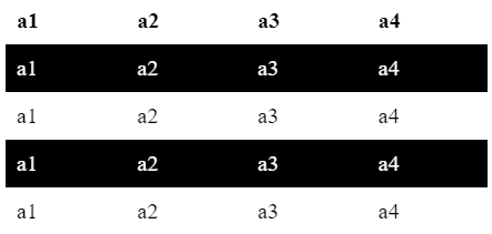
Example 1:
<!DOCTYPE html>

<html>

<head>

<style>

<!DOCTYPE html>

<html>

<head>

<style>

table {

border-collapse: collapse;

width: 100%;

}

th, td {

te

table {

border-collapse: collapse;

width: 100%;

}

th, td {

text-align: left;

padding: 8px;

}

tr:nth-child(even) {

background-color: black;

color: white;

}

</style>

</head>

<body>

<table>

<tr>

<th> a1 </th>

<th> a2 </th>

<th> a3 </th>

<th> a4 </th>

</tr>

<tr>

<td> a1 </td>

<td> a2 </td>

<td> a3 </td>

<td> a4 </td>

</tr>

<tr>

<td> a1 </td>

<td> a2 </td>

<td> a3 </td>

<td> a4 </td>

</tr>

<tr>

<td> a1 </td>

<td> a2 </td>

<td> a3 </td>

<td> a4 </td>

</tr>

<tr>

<td> a1 </td>

<td> a2 </td>

<td> a3 </td>

<td> a4 </td>

</tr>

</table>

</body>

</html>
Output:
 <!DOCTYPE html>
<html>
<head>
<style>
table {
border-collapse: collapse;
width: 100%;
}
th, td {
text-align: left;
padding: 8px;
}
tr:nth-child(even) {
background-color: black;
color: white;
}
</style>
</head>
<body>
<table>
<tr>
<th> a1 </th>
<th> a2 </th>
<th> a3 </th>
<th> a4 </th>
</tr>
<tr>
<td> a1 </td>
<td> a2 </td>
<td> a3 </td>
<td> a4 </td>
</tr>
<tr>
<td> a1 </td>
<td> a2 </td>
<td> a3 </td>
<td> a4 </td>
</tr>
<tr>
<td> a1 </td>
<td> a2 </td>
<td> a3 </td>
<td> a4 </td>
</tr>
<tr>
<td> a1 </td>
<td> a2 </td>
<td> a3 </td>
<td> a4 </td>
</tr>
<tr>
<td> a1 </td>
<td> a2 </td>
<td> a3 </td>
<td> a4 </td>
</tr>
<tr>
<td> a1 </td>
<td> a2 </td>
<td> a3 </td>
<td> a4 </td>
</tr>
<tr>
<td> a1 </td>
<td> a2 </td>
<td> a3 </td>
<td> a4 </td>
</tr>
<tr>
<td> a1 </td>
<td> a2 </td>
<td> a3 </td>
<td> a4 </td>
</tr>
</table>
</body>
</html>
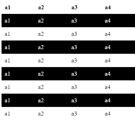
Output:
Advantages
- Styling Consistency: The use of CSS allows defining styles and styles again, but only once, and allows the reuse of style throughout fine elements and pages. This enhances the end-user experience by ensuring the responsiveness of your site to ensure a uniform look and feel.
- Reusability: By using CSS selectors and classes, you can build style elements that work with the others found across multiple items, including pages. By adjusting one CSS rule, you can change styles worldwide and avoid the surfeit of general code.
- Efficiency: CSS allows you to apply style to many elements at once, removing the need to repeat the styling action endlessly when compared with inline styling or using HTML attributes for styling purposes.
- Flexibility: CSS provides a wide range of design options, including ant layout combinational and acceleration. This is what makes the design versatile because, through it, you can create amazing designs for various screens and devices.
- Maintenance: CSS makes website design easier to update and maintain. Instead of modifying each HTML file, styling changes can be performed in the CSS file, which will impact all elements that use those styles.