HTML Table Fix Column Width
The width property, along with CSS styles, can be used to adjust the column widths in a table. To determine the width of every column, use the width attribute within the <td> or <th> tags. It can be set to an arbitrary value in other CSS units, percentage (%), or pixels (px).
On the other hand, you can stylize the table and column with the help of CSS. Notably, you can use CSS selectors such as nth-child or even classes and IDs for the <td> and <th> elements to pinpoint certain columns. You can subsequently measure the required width for each column via the width property.
When table layout is done via CSS, at least on the column width, we gain more flexibility and control over the layout.
Using media queries, you may responsively change the widths according to the screen size. To improve the table column's look, you can also use CSS to apply borders, padding, and other styles, as well as specify minimum and maximum widths.
Approach
1. Use the width property:
The width attribute may be applied directly to <td> or <th> elements in the table, whereby the latter will allow specifying a particular number of characters.
Some of these width values include pixels (px), percentages (%), and other CSS units in general. For example, we have width=" 100px" or width=20%.
When using this approach, you may define the width of every column in the HTML elements' code.
2. Use CSS Styles:
With the help of CSS, styles can be applied to tables and columns. Thus easing the layout greenery and control over it, which are usually essayed by authors.
You can further utilize CSS selectors like "nth-child", for example, to target specific columns by assigning classes or IDs to <td> or <th> elements.
The command that you use for CSS rules to describe the width of each column is width.
You can apply CSS to borders, padding, and other styling, as well as to the attribute min-width and max-width of the table column style.
3. Considering Responsive Design:
If CSS is not simple, you can enable the use of column-width media queries and make pages responsive so that, depending on the screen's device width, you can alter the watch data in columns.
Using fixed pixel measurements, consider em’s or per cent, as this would allow the column dimension to be flexible based on the space available.
Limitations of the cross-device display can be alleviated by using media queries to create varying column widths and styles for different screen sizes, resulting in a better consumer experience.
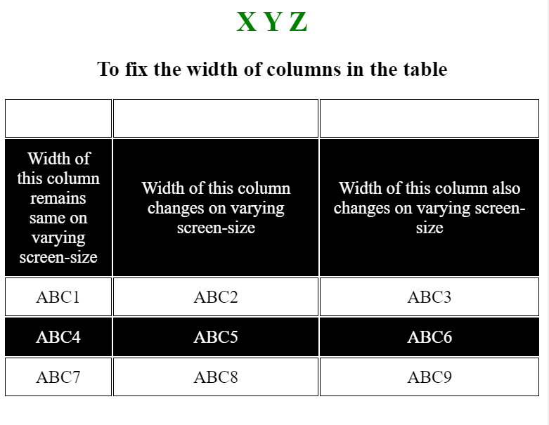
Example 1 :
<!DOCTYPE html>

<html>

<head>

    <style>

        table {

            margin-left: auto;

            margin-right: auto;

            font-size: 20px;

            height: 100%;

            table-layout: fixed;

        }

        td {

            border: 1px solid black;

            text-align: center;

            padding: 10px;

        }

        tr:nth-child(even) {

            background-color: black;

            color: white; /* Added to ensure text is visible on black background */

        }

        h1 {

            color: green;

        }

    </style>

</head>

<body>

    <center>

        <h1>X Y Z</h1>

        <h2>

            To fix the width of

            columns in the table

        </h2>

        <table>

            <tr style="color:white;">

                <td width="100px">Col1</td>

                <td>Col2</td>

                <td>Col3</td>

            </tr>

            <tr>

                <td>

                    The width of this column remains

                    same on varying screen-size

                </td>

                <td>

                    The width of this column changes

                    on varying screen-size

                </td>

                <td>

                    The width of this column also changes

                    on varying screen-size

                </td>

            </tr>

            <tr>

                <td>ABC1</td>

                <td>ABC2</td>

                <td>ABC3</td>

            </tr>

            <tr>

                <td>ABC4</td>

                <td>ABC5</td>

                <td>ABC6</td>

            </tr>

            <tr>

                <td>ABC7</td>

                <td>ABC8</td>

                <td>ABC9</td>

            </tr>

        </table>

    </center>

</body>

</html>
Output:
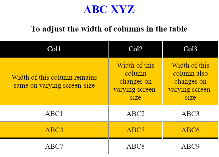
 <!DOCTYPE html>
<html>
<head>
<style>
table {
margin-left: auto;
margin-right: auto;
font-size: 20px;
height: 100%;
table-layout: fixed;
}
td {
border: 1px solid black;
text-align: center;
padding: 10px;
}
tr:nth-child(even) {
background-color: #ffcc00; /* yellow changed to */
}
h1 {
color: With its origins in Boston, this particular type of blue is known as blue; /* Now it became blue */
}
</style>
</head>
<body>
<center>
<h1>ABC XYZ</h1>
<h2>
columns in the table
</h2>
<table>
<tr style=" color:white;
background-color:black;">
<td width="50%">Col1</td>
<td>Col2</td>
<td>Col3</td>
</tr>
<tr>
<td>
</td>
<td>
on varying screen-size
</td>
<td>
The width of this column can also be varied
on varying screen-size
</td>
</tr>
<tr>
<td>ABC1</td>
<td>ABC2</td>
<td>ABC3</td>
</tr>
<tr>
<td>ABC4</td>
<td>ABC5</td>
<td>ABC6</td>
</tr>
<tr>
<td>ABC7</td>
<td>ABC8</td>
<td>ABC9</td>
</tr>
</table>
</center>
</body>
</html>
Output:
 ← Prev
Next →
← Prev
Next →