HTML Pie Chart
Pie charts are a popular form of data visualization form that presents percentages or proportions of a whole. They are often utilized to pinpoint data in a visually appealing and easy-to-understand form in fields such as academia, commerce, finance, and statistics.
The underlying principle underlying a pie chart is to divide a circular chart into segments, each of which corresponds to a particular category or segment proportion of the entire dataset. The size of every slice is proportional to the value represented by the slice relative to the total amount of data.
Typically used for comparing the relative sizes of several categories or parts within a dataset, in order to simplify and facilitate a quick comparison, pie charts need to be followed by a light blow torch. This visual representation enables viewers to readily comprehend data distribution, thus making it a reliable tool that can be leveraged to promote essential trends and insights.
Pie Chart, in particular, is efficient for representing the composition of the Whole or for treating categorical data. Such are common applications such as market share percentages, budgetary allotments, survey results, and demographic distributions. Pie charts can be limited despite their ease of understanding. When the categories increase beyond some limit, that effectiveness may be lost due to the difficulty of discriminating among small slices visually. Other methods, such as bar charts or even stacked bar charts, might be better on such occasions.
To create record pie charts directly on your website, you don't have to rely on third-party tools or frameworks. Consider HTML and CSS. You can create a basic pie chart. In this method, we will implement an HTML pie chart.
Step 1: Properly Forming HTML Structure.
We have to define the structural base of our HTML content before we can lay the CSS and HTML to represent the pie chart. Hence, it will mean the primary task of drawing a scheme from which our pie chart components will spew forth. Following this, we shall go ahead to create an empty HTML text file.
Code:
<!DOCTYPE html>
<html lang="en">
<head>
<meta charset="UTF-8">
<meta name="viewport" content="width=device-width, initial-scale=1.0">
<title>Pie Chart Tutorial</title>
<link rel="stylesheet" href="styles.css">
</head>
<body>
<div class="pie-chart">
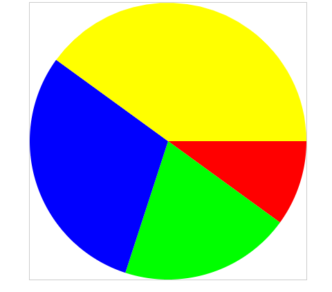
<div class="slice" data-value="30"></div>
<div class="slice" data-value="50"></div>
<div class="slice" data-value="20"></div>
</div>
</body>
</html>
Explanation:
The HTML document adoption as the pie chart's skeleton is partly. So, the skeleton of the HTML is a necessary document for our pie chart. The first line, which says `English,` is opened by `<!DOCTYPE html>` declaration. The head tag has nested tags that contain the canonical URL, attribution information, viewport parameters, and character encoding. On styling, it mentions the aforementioned `styles.css' offsite CSS file. The parent will be assigned a 'div' Element having the 'body>' with the class 'pie-chart' as its main container. Furthermore, 'div' is assigned per 'slice' in class 'slice,' and the 'data-value' attribute is present for each slice containing the data value of the corresponding data slice.
Step 2: Styling with CSS
Today, we will style pie charts with CSS following the process that I have described below. In order to realize this, you may use the "`style.css`" file as a part of the HTML file, which is a different one. In the CSS file, some attributes of the pie chart can be set, like size, color, position, etc. Thanks to this, both the required style and the order of slices will be saved through CSS. And as a final result, our pie chart will have a cool look which will attract the attention of readers.
Code:
/* Styling for the pie chart container */

.pie-chart {

    width: 200px;

    height: 200px;

    position: relative;

border-radius: 50%;

background-color: #f2f2f2; /* Light gray background */

}

/* Styling for each slice of the pie chart */

.slice {

    position: absolute;

    width: 100%;

    height: 100%;

    clip-path: polygon(50% 50%, 100% 100%, 0% 100%); /* Defining the shape of the slice */

background-color: #3498db; /* Blue color for the slice */

transform-origin: 50% 50%; /* Setting the rotation origin */

}

/* Defining the rotation angle for each slice */

.slice:nth-child(1) {

    transform: rotate(0deg);

}

.slice:nth-child(2) {

    transform: rotate(30deg); /* 30-degree rotation for the second slice */

    transition: transform 1s linear; /* Adding a transition effect for smooth rotation */

}

.slice:nth-child(3) {

    transform: rotate(80deg); /* 80-degree rotation for the third slice */

}

/* Styling for the pseudo-element that creates the curved edge of each slice */

.slice::before {

    content: " "; /* Adding content to the pseudo-element */

    position: absolute;

    width: 50%; /* Setting the width to create the curved edge */

    height: 100%;

background-color: inherit; /* Inheriting the background color of the slice */

    left: 0;

}

/* Rotating the pseudo-elements to create the curved edges for each slice */

.slice:nth-child(1)::before {

    transform: rotate(-1deg);

}

.slice:nth-child(2)::before {

    transform: translateX(-50%) rotate(-180deg);

}

.slice:nth-child(3)::before {

    transform: rotate(230deg);

}
Explanation:
This CSS code styles a pie chart and its many pie pieces. The size, position, and background color of the chart container are given in the `.pie-chart` class. The background color and absolute positioning of every `.slice' are defined, and the `clip-path' attribute creates triangular slices. Each slice is reshaped to resemble a pie chart using ': They start with ': before' pseudo-elements, which are rotated to their rightful places by 'nth-child' selectors. The generated code creates an engaging pie chart that is clear in its colors and segments.
Step 3: Slice Sizes- Adjusting.
It is at this stage that you can transform the values of the {data-value} attribute inside each slice element in order to make the sizes of the pie chart slices fit. The values represent the percentages or proportions of the whole dataset, and each slice in the pie chart indicates certain values visually. It is possible for you to adequately sketch the spread of your data and emphasize diverse informatic segments in the chart by editing these settings. Transform the 'data-value' properties as follows to make the desired proportions or percentages in your pie chart appear visibly.
Step 4: Test and adjust.
To analyze your pie chart, save your HTML and CSS files and open the HTML document within a web browser. High-level ideas in the following pie chart will appear, which consists of different slices that represent portions represented by the attribute's data values.' Within this f, you can obtain further customization as you can modify the CSS codes. In order to improve your pie chart, you can change colors, sizes, and positions as much as you want. Also, change different CSS variables to see what is needed for an ideal visual representation with detailed data insights shown in the chart.
Example: Creating a 3D pie chart
Code:
<!DOCTYPE html>

<html lang="en">

<head>

    <meta charset="UTF-8">

    <meta name="viewport" content="width=device-width, initial-scale=1.0">

    <title>3D Pie Chart Example</title>

    <!-- Drop in Chart.js library -->

    <script src="https://cdn.jsdelivr.net/npm/chart.js"></script>

</head>

<body>

    <canvas id="my3DPieChart" width="400" height="400"></canvas>

    <script>

        var data = {

            labels:  ['Work', 'Eat', 'Commute', 'Watch TV', 'Sleep'],

            datasets: [{

                data: [1, 2, 2, 2, 7],

                backgroundColor: [

                    'rgba(255, 99, 132, 0.6)',

                    'rgba(54, 162, 235, 0.6)',

                    'rgba(255, 206, 86, 0.6)',

                    'rgba(75, 192, 192, 0.6)',

                    'rgba(153, 102, 255, 0.6)'

                ],

                borderColor: [

                    'rgba(255, 99, 132, 1)',

                    'rgba(54, 162, 235, 1)',

                    'rgba(255, 206, 86, 1)',

                    'rgba(75, 192, 192, 1)',

                    'rgba(153, 102, 255, 1)'

                ],

                borderWidth: 1

            }]

        };

        var options = {

            responsive: false,

            title: {

                display: true,

                text: 'Activity time-series graph (3D pie chart)'

            },

            plugins: {

                datalabels: {

                    color: '#fff',

                    formatter: (value, context) => {

                        let sum = 0;

                        let dataArr = context.chart.data.datasets[0].data;

                        dataArr.map(data => {

                            sum += data;

                        });

                        let percentage = (value * 100 / sum).toFixed(2) + "%";

                        return percentage;

                    }

                }

            }

        };

        var ctx = document.getElementById('my3DPieChart').getContext('2d');

        var myPieChart = new Chart(ctx, {

            type: 'pie',

            data: data,

            options: options

        });

    </script>

</body>

</html>
Output:
Explanation:
Now, imagine that you start studying by adding a saved element inside an HTML file, which will be a pie chart regarding the daily routine developed using the Chart.js library. Part of the coding for Java Script is done here which sets up the data labels, value as well as styling. This is then instantiated by a rendering of the canvas element for the chart inserted into its context, followed by the pie chart initialization with data and entry of available options.
Advantages of Using HTML Pie Chart
- Integration Ease: In HTML charts, the selection of the graphics is not influenced by the usage of libraries or plugins, thereby making them widely usable. They weigh very little and, therefore, can be incorporated into any HTML and CSS files.
- Customization: Pie chart makers can be tailored and even embellished with CSS styles. Fast and easy to do is changing colors, fonts, sizes, and other things that control the appearance suitable for the web page's concept.
- Accessibility: Through semantic HTML elements along with proper syntax, the HTML-created classic pie chart can now be easily understood by both visual and non-visual users. Nevertheless, by including the differences between the charts and the use of alternate readings and aria properties, they could be read by screen readers and other assistive technology tools, as well as people who have visual disabilities.
With the use of responsive design, HTML pie charts can be aptly created to adjust to numerous screen sizes and devices. This ensures that the graphs will remain beautiful and practical on different devices ranging from tablets to mobile phones, smartphones, etc., as well as desktop computers.
- Cross-Browser Compatibility: HTML pie charts work perfectly fine with Chrome, Firefox, Safari Edge, and other modern web browsers. They do not depend on foreign frameworks or plug-ins, which reduces the chance of mismatching with different browsers and versions.
- Performance: HTML pie charts are quick to render with no required external dependencies or resources. Graphs made in this manner give superior performance and loading speeds compared to those that use JavaScript libraries or server-side rendering solutions.
Why and When to Use HTML Pie Chart
In a variety of scenarios when you need to express data on a web page visually, HTML pie charts might be helpful. In the following situations, employing HTML pie charts could be advantageous:
- Small Data Visualization: HTML pie charts can be an easy fix when you need to show small data sets or percentages in an eye-catching way. They offer an unambiguous depiction of ratios within a dataset.
- Quick Prototyping: In the early phases of web development, HTML pie charts are excellent for quickly prototyping or producing basic visuals. They let developers quickly test and iterate concepts because they require little setup and can be implemented using basic HTML and CSS.
- Static Content: HTML pie charts can be useful visual aids if most of the content on your website or web application is static and does not require sophisticated interactivity or dynamic data updates.
- Accessibility Requirements: By using semantic HTML elements and appropriate syntax, HTML pie charts can be made accessible to users with disabilities. To make sure they work with assistive devices, they can be improved using alternate text and aria characteristics.
- Compatibility and Performance: As compared to the other types, HTML pie charts are not dependent upon extra JavaScript libraries or server-side processing, and therefore, they work quite fast, as well as almost all modern web browsers support them. They are consequently a reliable alternative for displaying charts over the different systems and devices.