React Native Pressable
It manages all the touch inputs, and it is one of the core wrappers introduced in July 2022.
The Two important features of pressable are listed below-
- onPressIn
- onPressOut
onpressIn: We already know the work feature of onpress,onpressIn is a bit different from conventional onpress. Whenever the button is pressed, it is called.
onPressOut: The name has already given you a basic idea because we have just learned about onPressIn. So, it is called when the touch is removed or deactivated.
Props of Pressable:
Andriod_disableSound: We know that we get a default sound when we click on a button. If you want to remove or disable that well, then this prop can be used. It generally takes a boolean value. if it is true, then no sound will be played else
Sound will be played.
Android_ripple: We can enable or disable the rippling property of any app using this prop. It generally takes a boolean value.
Children: It is nothing but a function that receives the props whether the component is pressed or not.
Disable: If you want to disable the press property, then disable will be used. It generally takes a boolean value. If it is true, then the user cannot press the component.
Hitslop: It can be used to set additional distance outside of the component in which a press/touch can be detected.
Onpress: It is a well-known prop which is called after onpressout.
onpressIn: We already know the work feature of onpress,onpressIn is a bit different from conventional onpress. Whenever the button is pressed, it is called.
onPressOut: The name has already given you a basic idea because we have just learned about onPressIn. So, It is called when the touch is removed or deactivated.
Let's see one example -
App.js code:
import React, { useState } from 'react';
import { Pressable, StyleSheet, Text, View } from 'react-native';


const App = () => {
  const [times_Pressed, setTimesPressed] = useState(0);


  let textLog = '';
  if (times_Pressed > 1) {
    textLog = times_Pressed + ' times Pressed by user';
  } else if (times_Pressed > 0) {
    textLog = 'onPress';
  }


  return (
    <View style={{backgroundColor:'gray'}}>
      <Pressable
        onPress={() => {
          setTimesPressed((current) => current + 1);
        }}
        style={({ pressed }) => [
          {
            backgroundColor:'pink'

          },
          styles.wrapperCustom
        ]}>
        {({ pressed }) => (
          <Text style={styles.text}>
            {pressed ? 'yes Pressed!' : 'hello Press Me'}
          </Text>
        )}
      </Pressable>
      <View style={styles.logBox}>
        <Text testID="pressable_press_console">{textLog}</Text>
      </View>
    </View>
  );
};


const styles = StyleSheet.create({
  text: {
    fontSize: 16
  },
  wrapperCustom: {
    borderRadius: 8,
    padding: 6
  },
  logBox: {

    margin: 20,
    padding: 35,
    borderWidth: StyleSheet.hairlineWidth,
    borderColor: 'white',
    backgroundColor: 'white'
  }
});


export default App;
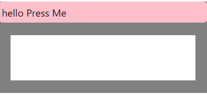
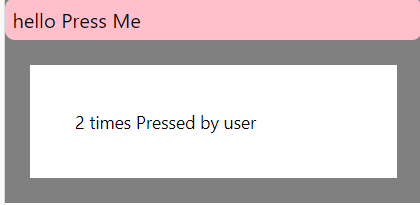
Output:
Explanation :
We use useState hooks here.
if (times_Pressed > 1) {
    textLog = times_Pressed + ' times Pressed by user';
  } else if (times_Pressed > 0) {
    textLog = 'onPress';
  }
This part of the code is for displaying the difference when the button is pressed multiple times. If pressed time is greater than 1, then it will show total pressed time + “times pressed by the user”. Example- if user presses it 2 times then the output will be “2 times pressed by the user”.
And if not greater than 1 then it will show only basic text.
<Pressable
        onPress={() => {
          setTimesPressed((current) => current + 1);
        }}
This part of the code is responsible for the simultaneous counting of numbers when the button is pressed.
Then we will be constructing a header for the app, A header that will be displayed above the button. You can see in the output that it shows 'hello press me'.
  logBox: {
        margin: 20,
    padding: 35,
    borderWidth: StyleSheet.hairlineWidth,
    borderColor: 'white',
    backgroundColor: 'white'
  }
});
This is the styling part. The logbox is styling for the box of white color that you can clearly see in the output, and the rest is for full-page styling like background color, padding, etc. Possibility API is generally used in Pressable.
This was all about react-native pressable. Next, we will be learning touchable opacity.