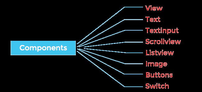
React Native Components
React Native components are the same as ordinary react components, but they are different in terms of rendering and styling. All react code lives in react components. They are independent and reusable.
View
view: It is a fundamental component. It is like the div component of HTML as it wraps another component.
App.js code :
import { StatusBar } from 'expo-status-bar';
import { StyleSheet, Text, View } from 'react-native';


export default function App() {
  return (
    <View style={styles.container}>
      <Text>Hello world! from javaTpoint!</Text>
      <StatusBar style="auto" />
    </View>
  );
}


const styles = StyleSheet.create({
  container: {
    flex: 1,
    backgroundColor: '#fff',
    alignItems: 'center',
    justifyContent: 'center',
  },
});
In this code, we can see that the text component is wrapped by the view component.
As you have seen this code previously, if you will not wrap the text component then you might get the following output -
Syntax error: Adjacent JSX elements must be wrapped in an enclosing tag. Did you want a JSX fragment <>...</>?Text
Text: The basic feature of the text component is that this can be used to display the text in our app. this can be used for styling, nesting, and touch handling too.
In the previous code, it is visible that whatever is written within the Text tag is visible on the output screen.
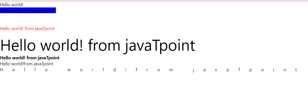
We have seen how we can show something on our app using Text component. Now lets see how we can modify or add style to it –
For changing background color :
To change the background color we have to add style and within style we will write the background color and then the name or hex code for the color.
<Text style={{backgroundColor : 'blue'}}>{"\n"}Hello world! from javaTpoint </Text>
For changing text color :
To change the text color we have to add style and within style we will write the background color and then the name or hex code for the color.
<Text style={{color : 'red'}}> {"\n"}Hello world! from javaTpoint</Text>
For changing fontSize :
To change the font size we have to add style and within style we will write fontSize and then the expected size.
<Text style={{fontSize: 50}} > {"\n"}Hello world! from javaTpoint </Text>
To change the font size we have to add style and within style we will write fontSize and then the expected size.
Making text bold :
We have to add style and within style write fontWeight and then ‘bold’. We can make it italic just by writing fontStyle instead of fontWeight and italic in the place of bold.
<Text style={{fontWeight:'bold'}} >{"\n"}Hello world! from javaTpoint</Text>
Aligning text in the centre:
For aligning text in the centre we have to add style and within style write textAlign and then centre . you can align text to right and left etc .
<Text style={{textAlign: 'center'}}>{"\n"}Hello world!from javaTpoint </Text>
Letterspacing :
In order to increase space between the words you can use letterspacing .
<Text style={{letterSpacing: 30}}>{"\n"}Hello world!from javaTpoint </Text>
Lets look at full code :
import { StatusBar } from 'expo-status-bar';
import { StyleSheet, Text, View } from 'react-native';
export default function App() {
return (
<view>
<Text>Hello world! </Text>
<Text style={{backgroundColor : 'blue'}}>{"\n"}Hello world! from javaTpoint </Text>
<Text style={{color : 'red'}}> {"\n"}Hello world! from javaTpoint</Text>
<Text style={{fontSize: 50}} > {"\n"}Hello world! from javaTpoint </Text>
<Text style={{fontWeight:'bold'}} >{"\n"}Hello world! from javaTpoint</Text>
<Text style={{textAlign: 'center'}}>{"\n"}Hello world!from javaTpoint </Text>
<Text style={{letterSpacing: 30}}>{"\n"}Hello world!from javaTpoint </Text>
<StatusBar style="auto" />
</view>
);
}
const styles = StyleSheet.create({
container: {
flex: 1,
backgroundColor: '#fff',
alignItems: 'center',
justifyContent: 'center',
},
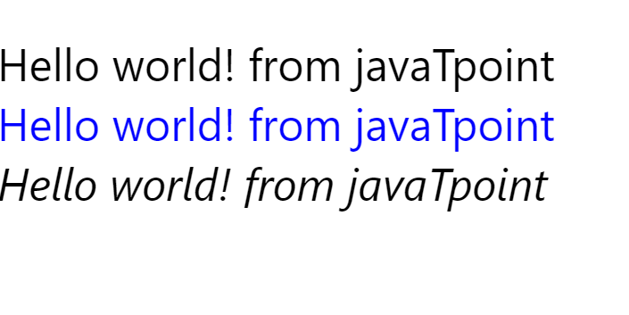
});Nested Text :
Now we are fimiliar with basic styling of Text component . lets look at nested Text.
Output :
Nested text :
It breaks the desired flow of text to obtain desired effect.
App.js Code:
import { StatusBar } from 'expo-status-bar';
import { StyleSheet, Text, View } from 'react-native';


export default function App() {
  return (
   <view>

      <Text style={{fontSize: 40}}>{"\n"}Hello world! from javaTpoint
      <Text style={{color : 'blue'}}> {"\n"}Hello world! from javaTpoint</Text>
      <Text style={{fontStyle :'italic'}}> {"\n"}Hello world! from javaTpoint</Text>
      </Text>
      <StatusBar style="auto" />
   </view>
  );
}


const styles = StyleSheet.create({
  container: {
    flex: 1,
    backgroundColor: '#fff',
    alignItems: 'center',
    justifyContent: 'center',
  },
});
Output:
Textinput :
Textinput : This is used to collect data/information from the user.
There are three types of text input :
• Single line input line control
• Multi line input line control
• Password input line control
import { StatusBar } from 'expo-status-bar';
import { StyleSheet, Text, TextInput, View } from 'react-native';


export default function App() {
return (
<view>

<TextInput></TextInput>
<StatusBar style="auto" />
</view>
  );
}


const styles = StyleSheet.create({
container: {
flex: 1,
backgroundColor: '#fff',
alignItems: 'top',
justifyContent: 'center',
},
});
By this, you can create a text input box but there is a problem that there is no border or style. so we will be adding border and some necessary stuff for making it decent
Updated Code :
import { StatusBar } from 'expo-status-bar';
import { StyleSheet, Text, TextInput, View } from 'react-native';


export default function App() {
  return (
   <view>

     <TextInput style={{borderColor: 'black',borderWidth: 5, margin:5}}placeholder= "javatpoint" placeholderTextColor={'red'}></TextInput>
      <StatusBar style="auto" />
   </view>
  );
}


const styles = StyleSheet.create({
  container: {
    flex: 1,
    backgroundColor: '#fff',
    alignItems: 'center',
    justifyContent: 'center',
  },
});
Output :
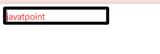
In this code, the border color will define the input box’s border color. The placeholder will give it a user-friendly gesture and by placeholderTextcolor we can change the color of the placeholder.
We can use the default value to fill the textbox with some predefined default value. We have to make sure that textinput value should not be editable by the user .
Scrollview :
Scrollview: This contains multiple child components and views. we can scroll and see what's inside the child components with a touch locking responder. both horizontal and vertical scrolling is possible, this gives an awesome feeling to the user.it will render lists of the names. scroll view must have bounded height.it works best when it consists of limited and small content. When we have a large number of items that might not fit on the phone screen then we should use FlatList.
A simple statement for better understanding - If you have a list of items then using scrollview is a better option, it also makes the User Interface better.
Suppose I have this list of data items – months – [ January, February, March, April, May, June, July, August, September, October, November, December ]
So let’s create one scrollview for this –
App.js code :
import React, { Component } from "react";
import { ScrollView, StyleSheet, Text, View } from "react-native";
class App extends Component {
state = {
months: [
{ months: "January", id: 1 },
{ months: "February", id: 2 },
{ months: "March", id: 3 },
{ months: "April", id: 4 },
{ months: "May", id: 5 },
{ months: "June", id: 6 },
{ months: "July", id: 7 },
{ months: "August", id: 8 },
{ months: "September", id: 9 },
{ months: "October", id: 10 },
{ months: "November", id: 11 },
{ months: "December", id: 12 },
] };
render() {
return (
<View>
<ScrollView>


{this.state.months.map((item, index) => (
<View key={item.id} style={styles.item}>
<Text>{item.months}</Text>
</View>
))}
</ScrollView>
</View>
);
}
}
const styles = StyleSheet.create({
item: {
flexDirection: "row",
justifyContent: "space-between",
alignItems: "left",
padding: 20,
margin: 2,
borderColor: "#fd6159",
borderWidth: 3,
backgroundColor: ""
}
});
export default App;
Output :
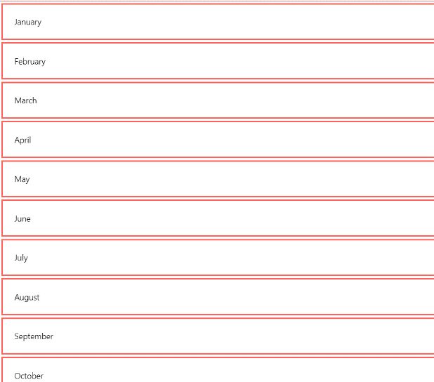
Further items can be seen by scrolling down! (in your simulator/phone/web);
ATTRIBUTES :
| alwaysBounceVertical | onScroll |
| horizontal | contentContainerstyle |
| scrollEnabled | bouncesZoom |
| zoomScale | maximumZoomScale |
| onContentSizeChange | centerContent |
| minimumZoomScale | scrollsToTop |
| pagingEnabled | snapToAlignment |
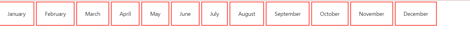
Lets make horizontal scrollview:
App.js code :
import React, { Component } from "react";
import { ScrollView, StyleSheet, Text, View } from "react-native";
class App extends Component {
state = {
months: [
{ months: "January", id: 1 },
{ months: "February", id: 2 },
{ months: "March", id: 3 },
{ months: "April", id: 4 },
{ months: "May", id: 5 },
{ months: "June", id: 6 },
{ months: "July", id: 7 },
{ months: "August", id: 8 },
{ months: "September", id: 9 },
{ months: "October", id: 10 },
{ months: "November", id: 11 },
{ months: "December", id: 12 },
] };
render() {
return (
<View>
<ScrollView
showsHorizontalScrollIndicator={false}
style={styles.contentContainerStyle}
horizontal={true}
showsVerticalScrollIndicator={false}>
{this.state.months.map((item, index) => (
<View key={item.id} style={styles.item}>
<Text>{item.months}</Text>
</View>
))}
</ScrollView>
</View>
);
}
}
const styles = StyleSheet.create({
item: {
flexDirection: "row",
justifyContent: "space-between",
alignItems: "left",
padding: 20,
margin: 2,
borderColor: "#fd6159",
borderWidth: 3,
backgroundColor: ""
}
});
export default App;
output :
Listview :
Listview: It is a simple view component of react native. it is created to display a vertically scrolling list efficiently.
Note: It is deprecated.
For implementing the list component we will be using Flatlist and section Sectionlist.
Flatlist: It is a built-in feature of react native which is mainly used to create and display a list of items. When we have a larger amount of data so in this case using Listview is a better option. It provides an efficient scrolling feature. While working with Listview you need to know these two properties –
1) data
2)render
data: It is an array of elements(items ).
render: It will take elements from the data array one by one and then it will render it.
before using Listview you need to import it.
Importing Listview:
import {Flatlist} from 'react-native';
creating a Flatlist :
import React, {useState} from 'react';
FlatList,
View,
Text,
SafeAreaView,
StyleSheet
} from 'react-native';
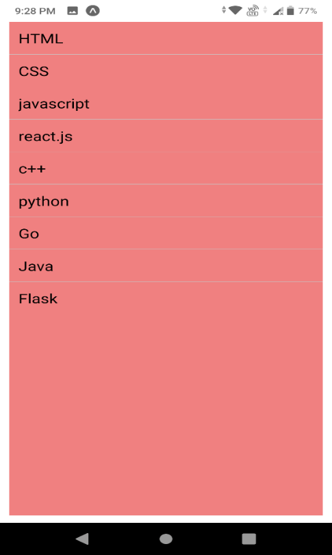
const dummyArray = [
{id: '1', value: 'HTML'},
{id: '2', value: 'CSS'},
{id: '3', value: 'javascript'},
{id: '4', value: 'react.js'},
{id: '5', value: 'c++'},
{id: '6', value: 'python'},
{id: '7', value: 'Go'},
{id: '8', value: 'Java'},
{id: '9', value: 'Flask'},
];
const App = () => {
const [listItems, setListItems] = useState(dummyArray);
const ItemView = ({item}) => {
return (
<View>
<Text
style={styles.item}
onPress={() => getItem(item)}>
{item.value}
</Text>
</View>
);
};
const ItemSeparatorView = () => {
return (
<View
style={{
height: 0.5,
width: '100%',
backgroundColor: '#C8C8C8'
}}
/>
);
};
const getItem = (item) => {
alert('Id: ' + item.id + ' Value: ' + item.value);
};
return (
<SafeAreaView style={{flex: 1}}>
<View style={styles.container}>
<FlatList
data={listItems}
ItemSeparatorComponent={ItemSeparatorView}
renderItem={ItemView}
keyExtractor={(item, index) => index.toString()}
/>
</View>
</SafeAreaView>
);
};
const styles = StyleSheet.create({
container: {
justifyContent: 'center',
flex: 1,
marginLeft: 10,
marginRight: 10,
marginBottom: 10,
marginTop: 30,
backgroundColor : '#F08080',
},
item: {
padding: 10,
fontSize: 18,
height: 44,
},
});
export default App;Output :
In the flatlist we have seen examples and the creation of Flatlist, but what if we want to display things that consist of some sections. well in that case we will use the section list. In Flatlist we cannot make different sections but in section list it is possible.
SectionList: Sections are a portion where we pass our list of elements when we combine these sections it will form a section list. Its code is different from Flatlist. the only key difference is that we are passing a list of elements section by section but in the case of Flatlist, we were passing the whole list of the element once.
App.js code :
import React from 'react';
import {
SafeAreaView,
StyleSheet,
View,
SectionList,
Text
} from 'react-native';
const App = () => {
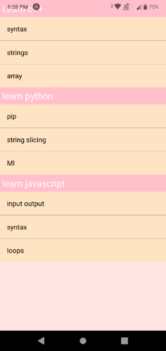
let A = [
{id: '1', value: 'syntax'},
{id: '2', value: 'strings'},
{id: '3', value: 'array'},
];
let B = [
{id: '4', value: 'pip'},
{id: '5', value: 'string slicing'},
{id: '6', value: 'Ml'},
];
let C = [
{id: '11', value: 'input output'},
{id: '12', value: 'syntax'},
{id: '13', value: 'loops'},
];
const javaTpoint = () => {
return (
<View style={styles.listItemSeparatorStyle} />
);
};
return (
<SafeAreaView style={styles.container}>
<View style={styles.container}>
<SectionList
ItemSeparatorComponent={javaTpoint}
sections={[
{title: 'Learn c++', data: A},
{title: 'learn python', data: B},
{title: 'learn javascript', data: C},
]}
renderSectionHeader={({section}) => (
<Text style={styles.sectionHeaderStyle}>
{section.title}
</Text>
)}
renderItem={({item}) => (
<Text
style={styles.sectionListItemStyle}
onPress={() => alert(JSON.stringify(item))}>
{item.value}
</Text>
)}
keyExtractor={(item, index) => index}
/>
</View>
</SafeAreaView>
);
};
export default App;
const styles = StyleSheet.create({
container: {
flex: 1,
justifyContent: 'center',
backgroundColor: '#FFE4E1',
},
sectionHeaderStyle: {
backgroundColor: '#FFC0CB',
fontSize: 20,
padding: 5,
color: '#fff',
},
sectionListItemStyle: {
fontSize: 15,
padding: 15,
color: '#000',
backgroundColor: '#FFE4C4',
},
listItemSeparatorStyle: {
height: 0.5,
width: '100%',
backgroundColor: '#708090',
},
});Output :
Properties :
| initiaListSize | renderRow | scrollrenderAheadDistance |
| onEndReachedThreshold | renderScrollComponent | stickHeaderIndices |
| pagesize | enableEmptysections | renderHeader |
| onEndreached | stickysectionHeadersEnabled | renderSectionHeader |
| renderSeparator | onChangeVisibleRows | removeClippedSubviews |
| renderFooter |
So we have learned about Listview, flatlist and section list. These are common, simple but important components.
Image :
Image component :
It is used to display different types of images. we can display local images as well as network images . image source will be a remote URL or local file resource.
Supported format of images : .png , .webp , . jpg, .jpeg , .gif ,. Psd , .bmp .
Type of images :
Network images – Images that are found and loaded from the browser or we can say the images that are delivered by any website are called network images.
Local images – Images that are available on the user’s device temporarily or permanently are known as local images.
Static resources- The resources of the user’s device that are not dynamic and do not change as called static resources.
React native provides the facility of optimizing the images for different devices. we have to add the suffix. they are “@2x” and “@3x”.we have to add these suffixes after the image name and before the extension.
For example, if my Image name is – flower.jpg
So it would be –
If we add these then the app will load the required image for a particular screen density.
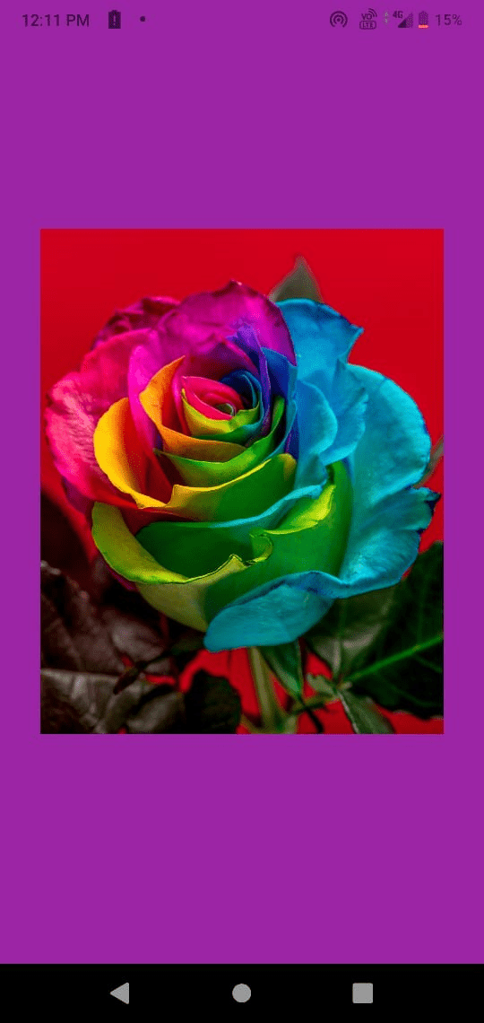
Let’s see how to use image component(network image ) –
import React from 'react';
import {
  StyleSheet,
  View,
  Image,
} from 'react-native';


const styles = StyleSheet.create({
  container: {
    flex: 1,
    backgroundColor: '#9b25a5',
    alignItems: 'center',
    justifyContent: 'center',
  },
});


export default class App extends React.Component {
  render() {
    return (
      <View style={styles.container}>
        <Image
          style={{ width: 300, height: 550 }}
          resizeMode="contain"
          // source={require('./assets/rn-school-logo.png')}
          source={{ uri: 'https://images.unsplash.com/photo-1599421498111-ad70bebb536f?ixlib=rb-1.2.1&ixid=MnwxMjA3fDB8MHxwaG90by1wYWdlfHx8fGVufDB8fHx8&auto=format&fit=crop&w=1964&q=80'}}  />
      </View>
    );
  }
}
Output :
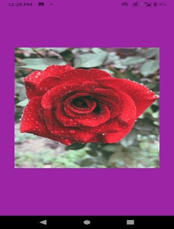
Importing Image from local storage :
Before we proceed ahead to the app.js code
You need to create a folder and save your picture there or in any folder of your app you can keep your picture but one thing “ path matters”. In the code below you can see that I have created a separate folder for my image and according to that I have given the path .
Syntax for path –
source={require ("./folder_name/name_of_image.jpg") }
(note : you have to replace “folder_name” and “name_of_image.extension” according to your files.
Check extension properly. )
import React from 'react';
import {
  StyleSheet,
  View,
  Image,
} from 'react-native';


const styles = StyleSheet.create({
  container: {
    flex: 1,
    backgroundColor: '#9b25a5',
    alignItems: 'center',
    justifyContent: 'center',
  },
});


export default class App extends React.Component {
  render() {
    return (
      <View style={styles.container}>
        <Image
          style={{ width: 300, height: 550 }}
          resizeMode="contain"

          source={require ("./image/img.jpg") }  />
      </View>
    );
  }
}
Note : If you have ran your server before adding image or saving image then if you will make changes to your code and add your image this is not going to work . it will show you error message that this file does not exist .
So after adding image source restart your server and then you can see your added image there .]
Output :
Properties of Image component :
| accessible | fadeDuration( for android only) |
| accessibilityLabel | loadingIndicatorSources |
| blurRadius | onerror |
| capInsets( for IOS only) | onLayout |
| defalutSource | onLoadEnd |
| onLoadStart | onPartialLoad |
| onProgress | progressiveRenderingEnabled |
resizeMethod:
This is used to change the dimension of the image according to need.
- auto
- resize
- Scale
resizeMode :
If the frame differs from raw image dimension then we use resizeMode.
- cover : It scales the height and width of image .(equal or greater than view)
- contain : It also scales height and width of image .( equal or lesser than the view)
- stretch : Through this we can scale height and width of the image independently.
- repeat : Until the view is covered image is repeated.
- center : It can be used to center the image .
- style : Used for styling.
Background image (ImageBackground) : it is the same as the background image of a web Application where CSS is used but here we will be adding a background image that is added using react-native. its props are similar to the Image component.
App.js code for backgroundimage :
import React from 'react';
import {
  StyleSheet,
  View,
  Image,
  ImageBackground,
} from 'react-native';
const styles = StyleSheet.create({
  container: {
    flex: 1,
    backgroundColor: '#9b25a5',
    alignItems: 'center',
    justifyContent: 'center',
  },
});
export default class App extends React.Component {
  render() {
    return (
      <View style={styles.container}>
        <ImageBackground
          style={{ width: 1000 , height:1000  }}
          resizeMode="contain"
          // source={require('./assets/rn-school-logo.png')}
          source={require ("./image/img.jpg") }  />
      </View>
    );
  }
}
Output :

Button :
Buttons in react-native :
The button is one of the important parts of the user interface, it provides an efficient way to interact with the user nicely. we can style the react-native button according to our needs but if you think that your button does not look good or you want some changes that are not possible by styling it then there is a way to handle this situation too. you can create buttons according to your need using TouchableOpacity or TouchableWithoutFeedback.
For creating button we need to add Button tag inside the View tag .
Syntax –
<Button title='title_of_button'> </Button>
Properties of a button :
onPress: When the user taps on the button it is called.
Title: It is the string that will be the name of the button. it is significant because through title
The purpose of the button is displayed and we can clearly understand what is the functionality of the button.
AccessibilityLabel: Text to be displayed for blindness accessibility features.
color: It signifies the color of the button. Color makes buttons beautiful.
disabled: it can disable the button means if it’s true then the user will not be able to click on the button.
nextFocusDown: when the user navigates down it designates the next view to receive focus.
nextFocusForward: when the user navigates forward it designates the next view to receive focus.
nextFocusLeft: when the user navigates left it designates the next view to receive focus.
nextFocusRight: when the user navigates right it designates the next view to receive focus.
nextFocusUp: when the user navigates up it designates the next view to receive focus.
testId: it is used to locate the views in the end-to-end tests.
touchSoundDisabled : (for android only ) whenever we click on a button we can hear a sound, so if we want to remove that sound then touchSoundDisabled can be used.
hasTVPrefferedFocus: it is for android TV.
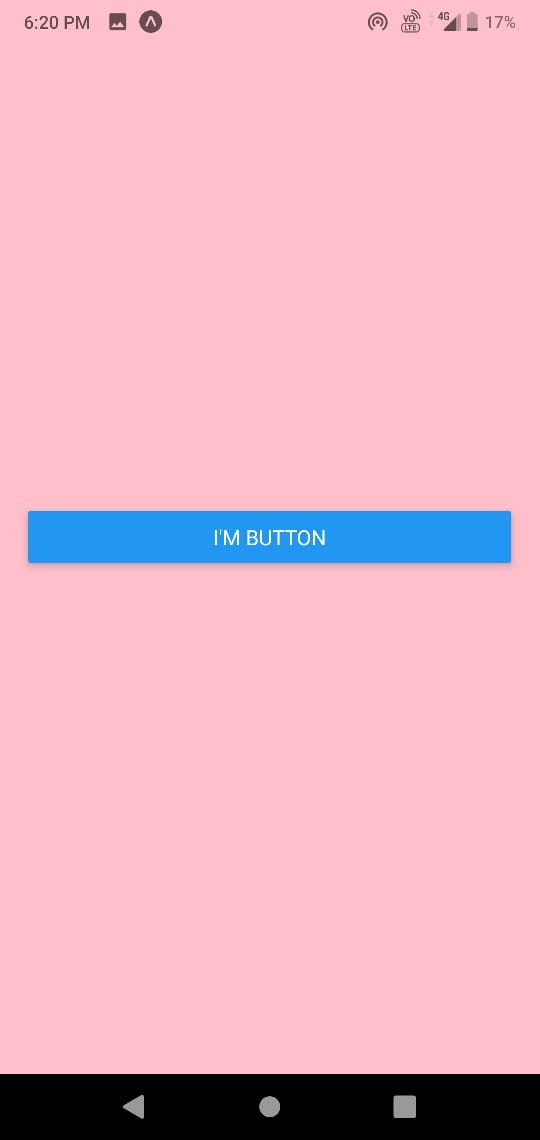
Let’s create one simple button using react-native :
App.js code :
import React from "react";
import { View, Button, StyleSheet, TouchableWithoutFeedback } from "react-native";
const App = () => {
  return (

    <View style={styles.screenContainer}>
      <Button title="I'm button" > </Button>
    </View>

  );
};
const styles = StyleSheet.create({
  screenContainer: {
    backgroundColor :'pink',
    flex: 2,
    padding : 19,
    justifyContent: "center",

  }
});
export default App;
Output :
This was a normal demo of the button! Let’s make something interesting using the button.
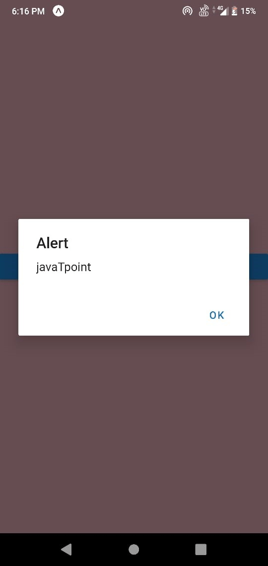
If we want to give an alert if someone clicks outside the button the following code can be used -
App.js code :
import React from "react";
import { View, Button, StyleSheet, TouchableWithoutFeedback } from "react-native";
const App = () => {
  return (
    <TouchableWithoutFeedback
    onPress={()=> alert('javaTpoint')}>
    <View style={styles.screenContainer}>
      <Button title="click on pink place " />
    </View>
    </TouchableWithoutFeedback>
  );
};


const styles = StyleSheet.create({
  screenContainer: {
    backgroundColor :'pink',
    flex: 2,
    justifyContent: "center",

  }
});


export default App;
Output :
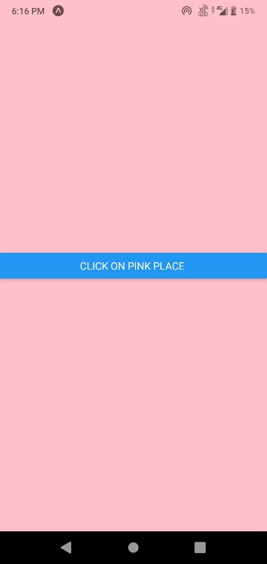
After clicking anywhere on pink wall you will get this output ;
One thing that makes Button complicated is that the button component accepts title and onPress and title but it does not support styling so it is a bit difficult to style the button.
If we want to customize the button then we can use <Pressable> instead of a button.
Switches
We all know what is a switch because we all use it in our normal life, feature of react-native switch is also similar but there are obviously some differences.
Let’s learn about functionality of a switch in react-native :
It is a controlled component that requires on value change callback to update its value. it generally accepts Boolean values either true or false. on value change updates the value to reflect user actions. If the value is not updated then it will continuously render the supplied value and there would not be any change by the user’s action.
How to import switch in react-native :
Syntax :
import {switch } from 'react-native'
Lets create one switch :
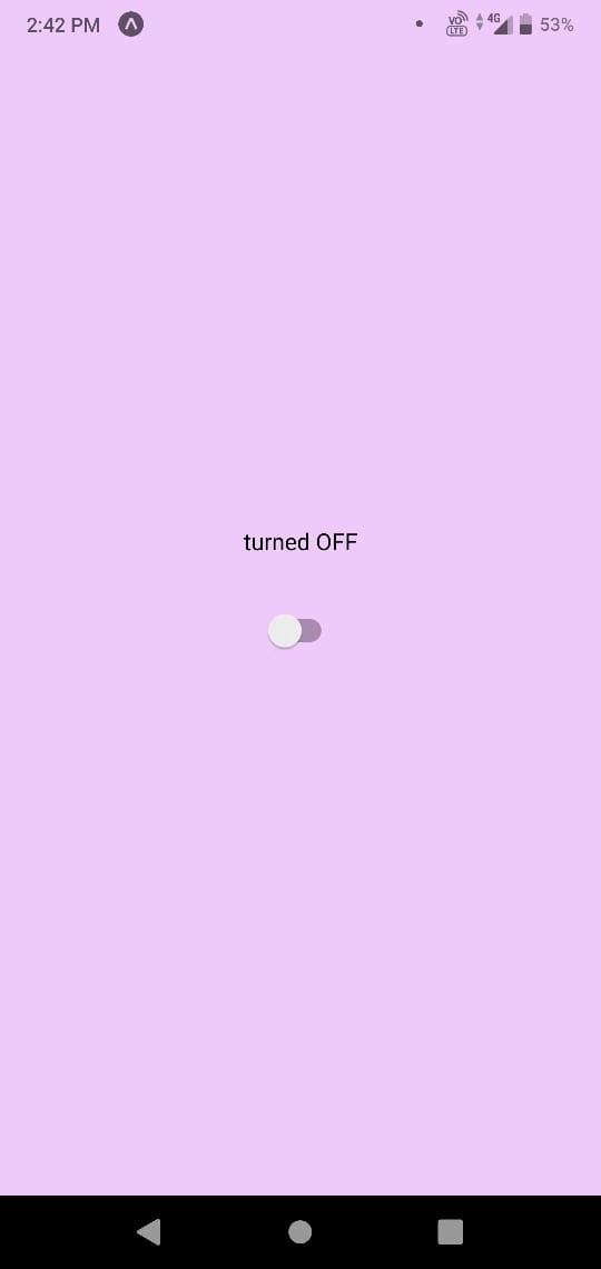
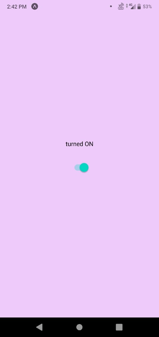
import React, {useState} from 'react';
import { Switch, View,Text, SafeAreaView,StyleSheet} from 'react-native';
  const App = () => {
  const [switchValue, setSwitchValue] = useState(false);


  const toggleSwitch = (value) => {
    setSwitchValue(value);

  };


  return (
    <SafeAreaView style={{flex: 1}}>
      <View style={styles.container}>
        <Text>
          {switchValue ? 'turned ON' : 'turned OFF'}
        </Text>
        <Switch
          style={{marginTop: 20}}
          onValueChange={toggleSwitch}
          value={switchValue}
        />
      </View>
    </SafeAreaView>
  );
};


const styles = StyleSheet.create({
  container: {
    flex: 1,
    justifyContent: 'center',
    alignItems: 'center',
    backgroundColor : '#eecafa'
  },
});


export default App;
Output :
Props of react-native switch :
Value: it is the value of the switch. it is of type bool means it can take two values either true or false. Its default value is false.
onChange: it is of type function whenever a user tries to change the state of switch it is invoked and it takes the changed event as an argument.
OnValuechange: it is also of type function. it is also invoked when the user tries to change the state of the switch. It only takes the new value as an argument. this is called when the function is activated.
trackcolor: it is responsible for the color of the track.
disable: through this, we can disable the switch. if its value is true then the switch will not work else if it is false then the switch will work.
thumbcolor : it is responsible for the color of the foreground.
Disabling Switch
import React, {useState} from 'react';
import { Switch, View,Text, SafeAreaView,StyleSheet} from 'react-native';
  const App = () => {
  const [switchValue, setSwitchValue] = useState(false);


  const toggleSwitch = (value) => {
    setSwitchValue(value);

  };


  return (
    <SafeAreaView style={{flex: 1}}>
      <View style={styles.container}>
        <Text style= {{fontSize:50}}>
         {switchValue ? 'turned ON' : 'turned OFF'}
        </Text>
        <Switch

          onValueChange={toggleSwitch}
          value={switchValue}

          disabled={true}
        />
      </View>
    </SafeAreaView>
  );
};


const styles = StyleSheet.create({
  container: {
    flex: 1,
    justifyContent: 'center',
    alignItems: 'center',
    backgroundColor : '#eecafa'
  },
});


export default App;
Output :
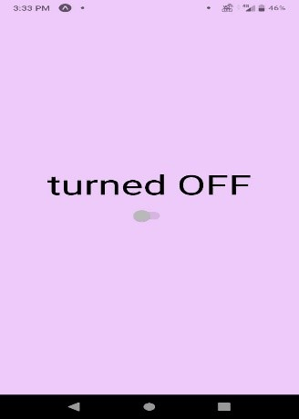
After running the following code you can see that switch has been disabled .
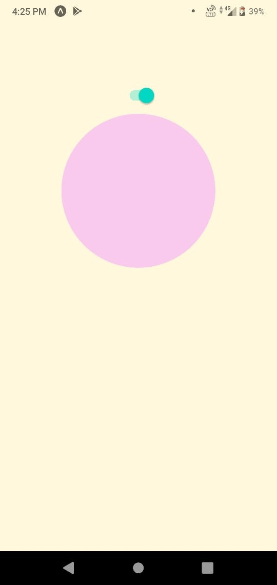
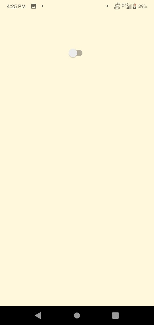
Lets create something interesting
App.js code :
import React, { useState } from "react";
import { StyleSheet, View, Switch } from "react-native";


export default function App() {
  const [isShown, setIsShown] = useState(false);
  const toggleTheBox = () => {
    setIsShown((previousState) => !previousState);
  };


  return (
    <View style={styles.container}>
      <Switch
        trackColor={{ false: "5CFFD0 ", true: "5CFFD0" }}
        thumbColor={isShown ? "5CFFD0" : "5CFFD0"}
        onValueChange={toggleTheBox}
        value={isShown}
      />
      {isShown === true ? <View style={styles.circle}></View> : null}
    </View>
  );
}
const styles = StyleSheet.create({
  container: {
    paddingTop: 100,
    flex: 1,
    alignItems: "center",
    backgroundColor: "#FFF8DC",
  },
  circle: {
    height: 200,
    width: 200,
    borderRadius: 200,
    backgroundColor: "#facaee",
  },
});
Here through this code, we can create a switch and when the switch will be turned on we can see a pink circle after turning the switch off the pink circle also disappears.
Output :
So we have covered almost all the core components of react-native. now I think you have gained some basic understanding of react-native. We will be learning many other things but learning components is important so make sure to not skip any core component.