CSS Responsive Design
CSS Responsive Design
Suppose we are using our laptop to read this article about responsive web design. We decide to save some of the most important points before using our phone to call it a day.
What if the same website is hard to use on our phone, with text that overlaps and graphics that won't fit on the screen, and we have to drag our fingers over the screen to make it work?
This isn't exactly what a user would hope for, though. Is it not? All of us desire seamless website navigation on all devices, including laptops and mobile phones.
One question that may come to mind is if we should create several web pages for various devices, and if this is the case, developing several websites with the same function won't be easy for the developers.
The responsive web design is about to take off! It assists developers in creating websites that are responsive to various screen sizes so that users may have a wonderful user experience across all platforms and devices.
Let's explore the concept of responsive web design in more detail!
How Does Responsive Web Design Work?
Building websites with HTML and CSS that appear nice on all devices, regardless of browser settings and screen size, is known as responsive web design.
Note: When creating a website, make every effort to prevent horizontal scrolling.
To make the website responsive to responsive web design, CSS adheres to the following principles:
Grid-Based Layout
A grid-based layout allows for relative site scaling. A responsive grid view typically consists of 12 grids or columns, that may be adjusted based on the browser window, with a total width of 100%.
Videos, images, and other components with responsive resizing across viewport widths and devices.
Media queries
In CSS, media queries aid in determining the viewport's size. It makes use of the next two parts of the query: 1. Media type: print, screen, etc. 2. The media feature and trigger size query, which includes the height, width, orientation, resolution, and other details.
How can we make a CSS grid layout that is responsive?
When fixed-sized grid elements adjust to the size of the viewport, the layout is considered to be responsive. The website seems more professional when it is responsive. You must surpass the design of your website. We're going to discover how to make a CSS grid layout that is responsive.
Code
<!DOCTYPE html>
<html>
<head>
<title>Example for CSS Responsive grid </title>
<style>
.grid {
display: grid;
margin: 6px;
grid-gap: 7px
}
.grid>div {
font-size: 25px;
padding: 2rem;
color: black;
text-align: center;
background: pink;
}
.auto-fit {
grid-template-columns: repeat(auto-fit,
minmax(250px, 1fr));
}
.auto-fill {
grid-template-columns: repeat(auto-fill,
minmax(250px, 1fr));
}
</style>
</head>
<body>
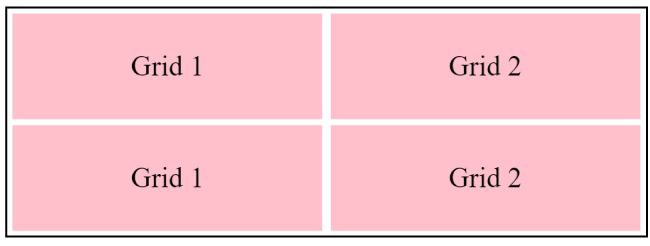
<div class="grid auto-fill">
<div>Grid 1</div>
<div>Grid 2</div>
</div>
<div class="grid auto-fit">
<div>Grid 1</div>
<div>Grid 2</div>
</div>
</body>
</html>
Output
Media queries
Media queries are used for various style guidelines on a range of device sizes, including desktops and mobiles.
Code
<!DOCTYPE html>

<html>

<head>

    <style>

        body {

            background-color: pink;

        }

        @media screen and (max-width: 400px) {

            body {

                background-color: lightblue;

            }

        }

    </style>

</head>

<body>

    <p>

        It will display light blue if the screen size is less than 400 pixels, or pink otherwise.

    </p>

</body>

</html>
Output
When screen size is more than 400px:

When screen size is less than 400px:

A brief explanation of how to use media queries
There are three ways that media queries can be used:-
1. @import rule @import screen and (min-width:600px) from url(scalertopics.css)
2. Adding the media query straight to the @media style sheet and (min-width:600px)
3. A query is included in the following link: <link rel="stylesheet" media="screen" and (min width:600px)">
Why is a CSS framework needed?
In essence, CSS frameworks are a grouping of several stylesheets created by developers that offer consumers pre-compiled stylesheets with common web design features that require little modification to the HTML code.
Frameworks facilitate development by offering existing structures and code snippets that reduce the effort of creating the same code again for each new website. The majority of CSS frameworks are responsive by nature, working with all browser versions.
Instead of tediously developing CSS codes from scratch, using a CSS framework saves time and results in fewer problems in the code.
Top trending free & open-source CSS framework with responsive design:
Pure CSS
Absolute Tables, grids, forms, buttons, bases, and menus are the six fundamental modules that makeup Yahoo's CSS framework. It is a platform-independent web page framework that is free and open-source. The websites created using Pure.css are user-friendly and responsive.
Skeleton: A free open-source CSS framework is called Skeleton. The Skeleton CSS framework provides a versatile boilerplate that can be useful for smaller applications. It has several modules such as:
grid: This grid has a maximum width of 960 pixels and 12 columns.
typography: the unit of liquid measure is rems.
skeleton: The skeleton is equipped with two separate buttons. The main and standard buttons are these.
forms: button, option, and input formats are standard for forms.
lists: The framework creates basic styles for both ordered and unordered lists.
Similarly, responsive and user-friendly features are available for tools, media, and tables.
Material UI: A React UI framework that is free and open source.
Material UI provides various React components. Material UI's integrated CSS preprocessor provides many UI functions. Any website can have a responsive website design that improves functionality thanks to the material user interface. It is adaptive and provides a seamless user experience for developers and users.
Bootstrap: A Free and Open Source CSS Framework
One of the most widely used CSS frameworks is Bootstrap. Famous websites like Airbnb, Walmart, Bloomberg, and others were made on this site. It prefers mobile devices and is built on a 12-column web architecture. There is also a J-Query function. The powerful and reliable Bootstrap UI toolkit creates responsive websites with a smooth user interface.
Semantic UI (free and open source CSS framework with jQuery and LESS integration)
After UI development, Semantic UI lets us use the same code everywhere and makes debugging easy with clear HTML and intuitive JavaScript. It creates beautiful layouts with adjustable file sizes, customizable settings, and responsive web design.
Tailwind CSS
Tailwind CSS is a CSS framework that aims to make things more usable by combining small parts and emphasizing utility. Thanks to a much faster user interface creation process, website design can be more flexible and personalized. This facilitates local changes.
Bulma
Responsive CSS Framework Bulma uses the simplest flexbox-based grid structure for easy customization and resizing. Bulma can be configured by installing a .sass file or using a precompiled .css file, depending on the specific needs and capabilities of web development.
Cascade: An Open Source and Free CSS Framework
CSS (Cascade Style Sheet) itself served as a template for the name "Cascade" as a CSS framework. It uses an algorithm to calculate the value of CSS properties using CSS declarations of different origin types at different levels.
Responsive Design Frameworks: Pros and Cons
Browser Compatibility
We already know that websites have different default settings in different operating systems and behave differently in different browsers. Responsive web design frameworks are usually tested across multiple browsers to run a smooth website. Therefore, incorrectly writing browser-specific CSS code makes debugging and code validation difficult.
Configuring Entries
It is recommended to first take care of the basic elements of the website and then download and install all necessary installers and packages. This is because files, style packs and widgets must be loaded to use the CSS framework; some of them may need to be installed. If not, it will reduce clutter and load time.
Code Editing
Although many CSS frameworks come with prepackaged, fully functional code that doesn't require much editing, sometimes developers need to modify existing CSS to make it work on a web page. Therefore, customizing CSS codes requires an understanding of CSS, even if you are using a framework.
Usage
Separate modules should be created for each style attribute provided by CSS to avoid misuse of elements. CSS frameworks allow access in this way. Users can customize styles, access alternative content, and hear text as it sounds before it is converted to speech.
Conclusion
- From our previous understanding of several topics related to responsive web design and our introduction to several CSS frameworks, it should be clear that a website's ability to function properly on different devices is essential to providing a positive user experience.
- By eliminating the need to create duplicate code, using a framework simplifies development from a developer's perspective.
- Using frames promotes flexibility by saving you time learning complex CSS concepts.