CSS Background Image
Background Image Syntax
Make sure to create an assets directory (folder) to store the photos you intend to utilise in your project as the first step.
As an illustration, we may upload the image sunset.png that we wish to utilise to the project's images folder.
With the help of the background-image CSS property, you can then position the picture in front of any HTML element you choose.
This might be the entire page (using the body selector in CSS to target the element in our HTML) or simply a stand-alone area of the page, such a section element as in the example below.
The code below should be written in your.css file to add a background picture to a section tag:
section {

bg-image: url("images/sunrise.png");

}

- The tag you wish to put the image to is specified by section.
- To inform CSS where to get our picture, we utilise the url() function.
- The path to the picture is "images/sunset.png" and it is enclosed in brackets. This instructs the browser on which URL to retrieve.
- Since it is a local file, relative to our project, and to our current working directory, the path in this example is referred to as a relative path and is not a web address. We may also utilise an absolute path, which is a complete web address that begins with a domain URL (http://www. ), to upload pictures.
- Although using quotes is a good practise, we may eliminate them and the result is the same: background-image: url(images/sunset.png).
- Remember to use a semicolon!
How to Stop Background Repeat
A background picture will automatically repeat when applied to an element.
The picture will repeat in order to fill up the tag if it is smaller than the tag of which it is the backdrop.
How do we stop this from happening?
The background-repeat property accepts 4 values and allows us to alter the direction in which the picture repeats or completely stop it from doing so.
section {

bg-repeat:

repeat;

}
If we do not specify a value for the background-repeat property, this is the default value. In this instance, the picture is repeated both horizontally and vertically, or in the x- and y-axes, respectively, until the space is filled.
section {

bg-repeat:

no-repeat;

}
The picture is prevented from repeating itself in all directions by the no-repeat setting. The picture is only displayed once.
section {

bg-repeat:

repeat-y;

}
With this setting, the image is repeated just horizontally on the page. The picture is repeated in the x-direction throughout the page. In mathematics, the x-direction is from left to right.
section {

bg-repeat:

repeat-y;

}
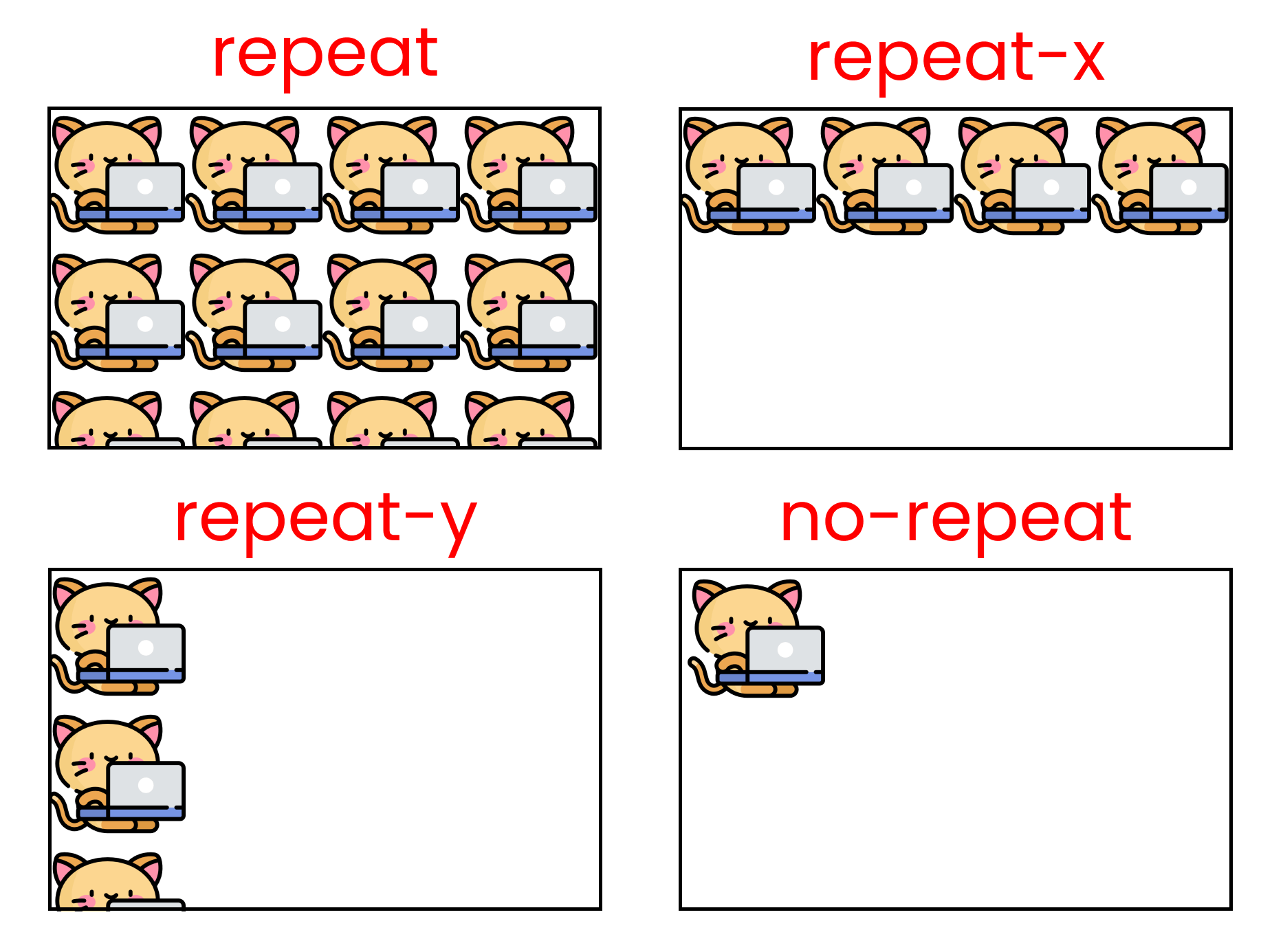
This value merely vertically duplicates the picture on the page. The picture is repeated in the y direction, moving down the page. In mathematics, the y-direction runs from top to bottom.
How to Set Background Position
We may further regulate how a background picture appears within the backdrop of the tag by enhancing its position after adding it and preventing it from recurring.
To do this, we will use the background-position attribute.
Two values are accepted by the selection. The first one determines how far across the tag is in the horizontal direction, or x-direction. The second one indicates how far down the tag is in the vertical direction, or y-direction.
The values may be expressed as units, such as two pixels:
section {

bg-position: 20px 30px;

}
This will shift the picture across the contained tag by 20 pixels and down by 30 pixels.
Instead of using pixels, we may position the picture at the right, left, top, down, or centre of the tag by using a series of keywords like right, left, top, or center.
section {

bg-position:

right center;

}
This positions the picture to the right of the tag's centre.
The following would be done in order to centre it both horizontally and vertically:
section {

bg-position: center center;

}
It is important to note that we may utilise percentages to place a picture with more precision.
section {

bg-position:

20% 40%;

}
This places the picture 40% down and 20% across the tag.
Although the values used thus far have been combined, we may also give just one value, such as background-position: 20px, background-position: center, or background-position: 20%, which applies it in both directions.
How to Resize a Background Image
The background-size property may be used to modify the background image's size.
It accepts two values once more, just like the previously described properties.
One each for the vertical (y) size and the horizontal (x) size.
Pixels can be used as follows:
section {

bg-size: 20px 40px;

 /* the picture is 20 pixels wide and 40 pixels along the page. */

}
There are a number of particular values we may provide the property if we are unsure of the precise width of the container we are storing the picture in.
background-size: cover; resizes the background picture to fill the whole background area of the tag, regardless of tag width. The picture will be stretched and therefore cropped at the margins if it is too large and has a greater ratio than the tag it is in.
background-size: contain; as the name implies, contains the picture. It will ensure that the entire image is seen in the backdrop without any portions being cropped out.
We may use the background-repeat: no-repeat; rule we described previously if the picture is significantly smaller than the tag since the empty space will cause it to repeat in order to fill the gap up.
The picture will be cropped in this scenario according to the rule background-size:cover.
The picture shrinks to fit the section tag when we change it to background-size:contain.
How to Use the Background Attachment Property
We may choose where the background picture is attached, that is, whether the image is fixed to the browser, using the background-attachment attribute.
The background picture follows the natural flow of the page by scrolling up and down when background-attachment is set to scroll, which is the default setting.
The property's second potential value is background-attachment: fixed;
By doing this, the background picture is kept in place and is fixed to the page and the browser's viewport. You can see an illustration of the parallax effect created by this here:
//HTML code

<section class="img-1">

</section>

<section class="img-2">

</section>

<section class="img-3">

</section>

<section class="img-4">

</section>

//CSS code

section{

    height:100vh;

    width: 100%;

    background-position:center;

    background-repeat: no-repeat;

    background-size: cover;

   background-attachment: fixed;

}

.img-1 {

  bg-image: url("https://www.google.com/imgres?imgurl=https%3A%2F%2Fimages.pexels.com%2Fphotos%2F257360%2Fpexels-photo-257360.jpeg%3Fcs%3Dsrgb%26dl%3Dpexels-pixabay-257360.jpg%26fm%3Djpg&tbnid=neSSjHzVUzUhiM&vet=12ahUKEwjypvmf8I-AAxXziGMGHYK3DF4QMygAegUIARDrAQ..i&imgrefurl=https%3A%2F%2Fwww.pexels.com%2Fsearch%2Fnature%2520background%2F&docid=8XuhtxSRxFSBCM&w=2000&h=1333&itg=1&q=nature%20background&ved=2ahUKEwjypvmf8I-AAxXziGMGHYK3DF4QMygAegUIARDrAQ ")

}

.img-2 {

  bg-image: url("https://www.google.com/imgres?imgurl=https%3A%2F%2Fstatic.vecteezy.com%2Fsystem%2Fresources%2Fpreviews%2F003%2F114%2F039%2Foriginal%2Fwood-planks-floor-with-mountain-view-beauty-nature-background-free-photo.jpg&tbnid=axdHUnlFUK8ErM&vet=12ahUKEwjypvmf8I-AAxXziGMGHYK3DF4QMygEegUIARDzAQ..i&imgrefurl=https%3A%2F%2Fwww.vecteezy.com%2Ffree-photos%2Fnatural-background&docid=BHTqy0si38N7XM&w=4305&h=3287&q=nature%20background&ved=2ahUKEwjypvmf8I-AAxXziGMGHYK3DF4QMygEegUIARDzAQ ");

}

.img-3 {

  bg-image: url("https://www.google.com/imgres?imgurl=https%3A%2F%2Ft3.ftcdn.net%2Fjpg%2F05%2F55%2F82%2F46%2F360_F_555824600_OvpqblejjhjExcDDulsWkY3RxDrAr2hF.jpg&tbnid=Fx7-buVR2xPWMM&vet=12ahUKEwjypvmf8I-AAxXziGMGHYK3DF4QMygIegUIARD8AQ..i&imgrefurl=https%3A%2F%2Fstock.adobe.com%2Fsearch%2Fimages%3Fk%3D%2522nature%2Bbackgrounds%2522&docid=qZKcq1qqFmF48M&w=540&h=360&q=nature%20background&ved=2ahUKEwjypvmf8I-AAxXziGMGHYK3DF4QMygIegUIARD8AQ ");

}

.img-4 {

  bg-image: url("https://www.google.com/imgres?imgurl=http%3A%2F%2Fm.gettywallpapers.com%2Fwp-content%2Fuploads%2F2023%2F04%2FBeautiful-Nature-Wallpaper.jpg&tbnid=Rr9Ob7z869Ze-M&vet=12ahUKEwjypvmf8I-AAxXziGMGHYK3DF4QMygMegUIARCGAg..i&imgrefurl=http%3A%2F%2Fm.gettywallpapers.com%2Fbeautiful-nature-wallpapers-2%2F&docid=y5Pwkk8WB2NydM&w=1080&h=1920&q=nature%20background&ved=2ahUKEwjypvmf8I-AAxXziGMGHYK3DF4QMygMegUIARCGAg ");

}
Background Gradients
The background-image attribute may also be used to instruct the browser to generate a gradient, which is a separate use case.
In this instance, the background picture has a linear gradient rather than a URL.
To indicate the angle is the simplest method to achieve this. This regulates the gradient's direction and the way the colours will meld. The background of the tag should now have two colours that you wish to mix in a gradient.
A top-to-bottom gradient that changes from black to white is:
section {

bg-image: linear-gradient(black,white);

}
The following degrees are frequently used for gradients:
- 0deg from top to bottom
- 90deg from left to right
- 180deg from bottom to top
- 270deg from right to left
The degrees shown above stand for top, right, bottom, and left, respectively.
Section {

bg-image: linear-gradient (to left,pink,orange);

}
//HTML code
<section></section>
//CSS code
section {

  bg-image: linear-gradient (to left,pink,orange);

  height: 100vh;

}
Instead of keyword colors we can use hex colors to be more particular and have a wider range of options:
section {

  bg-image: linear-gradient (to left,#42275a, #734b6d)

      }
//HTML code
<section></section>
//CSS code
section{

  bg-image: linear-gradient(to left,#42275a, #734b6d);

  height: 100vh;

}
Additionally, we may use more than two colours to create gradients with various effects and colour schemes.
Conclusion:
CSS background images let you add photos as backgrounds to HTML components to improve the aesthetics of your webpages. You may give the URL or path of the image file you wish to utilise by using the background-image attribute.
The background-repeat parameter also gives you control over how the background picture repeats itself. Utilising attributes like background-position, background-size, and background-attachment will allow for much more customisation. You may position, resize, and manage the image's scrolling behaviour using these attributes.
There are countless ways to construct aesthetically beautiful and engaging webpages with CSS background pictures. You may create distinctive and imaginative effects by experimenting with various backdrop features, which will improve the user experience.