Scatter Plot in PANDAS
Scatter Plot
The scatter plot is a method which shows the relation between two variables in a dataset. The scatter plot is generally used when a person is dealing with two independent variables. The scatter plot is generally a graph of ordered pairs in x and y coordinates. Generally the scatter plots are measured in terms of correlation.
The correlation is nothing but the relationship between the two variables if the relationship is stronger they are said to be positively correlated and if the relationship is weak then the variables are negatively correlated and if there is no relationship between the variables then they are said to be not correlated.
Pandas Scatter Plot
In python pandas we use the class “DataFrame” and the member in this class is “Plot”. The scatter( ) function is used to plot the relationship between the two variables in scatter format. We can also customize the colors in a scatter plot in pandas using the c parameter.
Generally, we must follow some steps to draw a scatterplot using pandas they are:
- We must import the required libraries to draw a scatterplot.
- We must organize the data.
- We must convert the data into a Dataframe.
- Finally we need to draw a scatterplot.
Loading Pandas DataFrame
Let us consider an example to perform the loading of the data into Dataframe in pandas.
Example:
#importing libraries
Import pandas as pd
#Organizing data
comparison={‘Name’:[‘Nihaas’, ’Nikitha’, ’Deeraj’ ,’Rohit’, ‘Rishika’,’Solmon’],
 ‘Height’:[164,154,172,170,162,168]}
#Load data into dataframe
df=pd.Dataframe( data=comparison )
#displaying data in dataframe
display( df )
Output:
  X                    Y
Nihaas                164
Nikitha               154
Deeraj                172
Rohit                  170
Rishika               162
Solmon               168
Here we have displayed the names of the students on the x axis and their respective heights on the y axis; we can also add the x-label and y-label in a scatter plot.
Plot Function
The .plot( ) method is used to make a scatter plot. This function passes the x and y parameters and also passes the kind of plot we require.
Syntax:
df.plot(x=None, y=None, kind=’parabola’, xlabel=None, ylabel=None ,c=None, s=None)
Parameter:
- x- The data along the x axis.
- y- The data along the y axis.
- kind- Which type of chart do we require?
- title- Title of the scatter plot.
- xlabel- x-axis label.
- ylabel- y-axis label.
- c- Color of the dots.
- s- Size of the dots.
Example:
df.plot(
x=’a’,
 y=’b’,
kind=’line’)
plt.show( )
Output:
Adding titles to Pandas Scatter Plot:
We can add the titles and the labels to our scatter plot in pandas .To perform this operation we can use these parameters:
- title= helps to add the title to our scatter plot.
- xlabel= helps to add xlabel title in our scatter plot.
- ylabel= helps to add ybalel title in our scatter plot.
Example:
#Adding titles to pandas scatter plot
df.plot(
x= ’ a ’,
y= ‘ b ‘,
kind=’line’
c=’red’
#Setting the title
title=’ Scatter plot in pandas ‘,
xlabel=’ x-axis ’,
ylabel=’ y-axis ‘,
)
Plt.show( )
Output:
Scatter plot in pandas

Here, we have plotted a linear scatter plot with a title an x label and a y label. We can also plot a scatter plot with modified sizes of the dots with the help of the s= parameter.
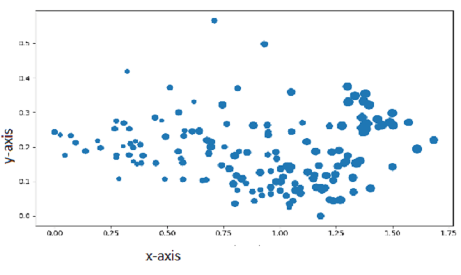
Scatter Plot with a Modified Size of Points
The size modification can be done with the help of s= parameter and the sizes are passed in the form of numerical values. Here, we use the pandas .map( )function .The map function is used to convert the ‘Label’ column to a numeric column
Example:
#Modifying the size of the dots in a scatter plot.
df[ ‘size’ ]=df[ ‘Label’ ].map({ ‘ Small ‘ : 15, ‘ Medium ‘ : 25, ‘ Large ‘ : 60})
df.plot (
      x=’ a ‘,
      y= ‘ b ‘,
      kind=’ scatter ‘.
      c=’ red ‘,
      # adding the titles to scatter plot
      title= ‘ Scatter plot with modified sizes of dots ‘,
      xlabel=‘ x-axis ‘,
      ylabel= ‘ y-axis ‘,
      # fixing the size parameter
       s=’ size ‘
)
#displaying the scatter plot
plt.show( )
Output:
Scatter plot with a modified size of dots
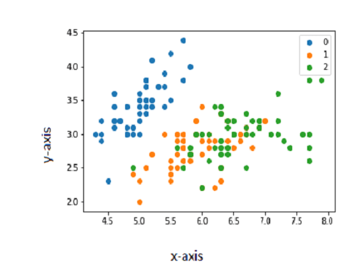
Multiple Colors in Pandas Scatter Plot
To make a multiline scatter plot we need to split the DataFrame into multiple DataFrames based on Label column. Then we need to add the different colors for different dot values.
Example:
df1 = df[ df[ ‘Label’ ] == ‘Small’ ]
df2 = df[ df[ ‘Label’ ] == ‘Medium’
df3 = df[ df [ ‘Label’ ] == ‘Large’ ]
ax= df1.plot(x=’ x ‘ , y=’ y ’, kind=’scatter’, c=’ b ’, label=’small’)
df2.plot (x=’ x ‘ , y=’ y ’, kind=’scatter’, ax=ax,  c=’ o ’, label=’Medium’)
df3.plot (x=’ x ‘ , y=’ y ’, kind=’scatter’, ax=ax,  c=’ g ’, label=’Large’)
plt.show( )
Output: