Scatter Plot in Matplotlib
Matplotlib:
Matplotlib is a library in python used to create static, animated and interactive visualizations. The library is used to create various plots like bar graphs, pie charts, histograms and many more. The matplotlib describes and analyses the data more efficiently and faster.
The matplotlib is specially used for dealing with large datasets. The matplotlib provides an interface like python but uses it and is an open source. The matplotlib provides the plt. scatter( ) to create a scatter plot.
Creating a Scatter Plot
The scatter plot is a method which shows the relation between two variables in a dataset. The scatter plot in matplotlib is created with the help ofplt.scatter( )to work with this command; we need to install the Mtplotlib using pipthe python’s standard package.
Now we shall create a scatter plot of the price of products on the x-axis and their sales on the y-axis.
Example:
#importing the pyplot from the matplotlib
import matplotlib.pyplot as plt


price = [2.50, 1.23, 4.02, 3.25, 5.00, 4.40]
sales= [34, 62, 49, 22, 13, 19]


plt.scatter(price, sales)
#displaying the scatter plot
plt.show( )
Output:
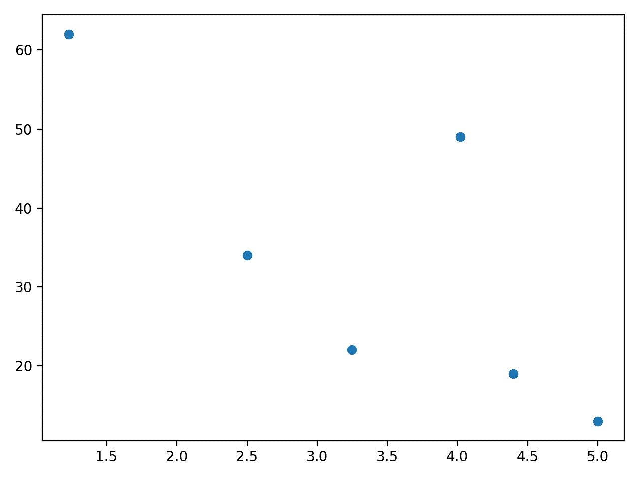
The above scatter plot shows the relationship between two variables. We can observe that sales are low when the price is higher.
Changing the Size of Dots:
The matplotlib uses the NumPy arrays because the Numpy helps in element-wise operation. We can change the size of the dots with the help of the s=parameter, which allows for changing the size.
Syntax:
plt.scatter( x_data, y_data, s=None)
Parameters:
- x_data- Consists of x-axis data.
- y_data- Consiste of y-axis data.
- s-size parameter( helps in changing the size of dots in scatter plot)
Example:
import matplotlib.pyplot as plt
import numpy as np


rates=np.asarray([2.50, 1.23, 4.02, 3.25, 5.00,4.40])
sales=np.asarray([34, 62, 49, 22, 13, 19])
profit=np.asarray([20, 35, 40, 20, 27.5, 15])


plt.scatter(x=rates, y=sales, s=profit*10)
plt.show( )
Output:
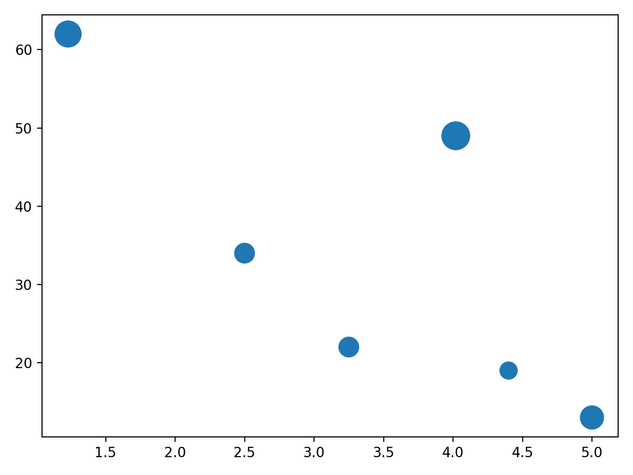
Here we can observe that the size of dots is different for different profits so that we can do the analysis more efficiently. We can also add different colours for each dot.
Changing the Colour of Dots
We can change the colour of each dot with the help of an array of colours with c as an argument.
Syntax:
plt.scatter(x_data,y_data,c=None)
Parameters:
- x_data: An array consisting of x-axes values.
- y_data: An array consisting of y-axes values.
- C: colour of each dot.
Example:
import matplotlib.pyplot as plt
import numpy as np


x_data = np.array([5,7,8,7,2,17,2,9,4,11,12,9,6])
y_data= np.array([99,86,87,88,111,86,103,87,94,78,77,85,86])
color_dot = np.array(["red","green","blue","yellow","pink","black","orange","purple","beige",
"brown","gray","cyan","magenta"])


plt.scatter(x_data, y_data, c=color_dot)
#displaying the scatter plot
plt.show( )
Output:

Scatter Plot with Different Shapes of Dots
We can also change the shape of the dots; we have a different “ marker "for each shape. In default, we set the marker as "o", representing a dot, and for the diamond shape, we set the marker as "d".
Syntax:
plt.scatter(x_data, y_data, marker=None)
Parameter:
- x_label: An array consisting of x-axis data.
- y_label: An array consisting of y-axis data.
- Marker: Used to change the shape of the dots in the scatter plot.
Example:
importmatplotlib.pyplot as plt
#First data for square shape
x_data_1 =[89, 43, 36, 36, 95, 10, 66, 38]
y_data_1 =[21, 46, 3, 35, 67, 95,53,72]
 #Second data for a triangle shape


x_data_2 =[26, 29, 48, 64, 6, 5,36,66]

y_data_2 =[26, 34, 90, 33, 38, 20, 56, 2]

plt.scatter(x_data_1, y_data_1, c ="pink",
            marker ="s",
            edgecolor ="green",
            s =50)

plt.scatter(x_data_2, y_data_2, c ="yellow",
            marker ="^",
            edgecolor ="red",
            s =200)

plt.xlabel("X-axis")
plt.ylabel("Y-axis")
plt.show()
Output:
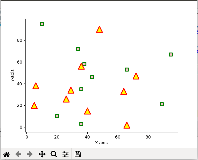
In the above example, we can observe that we have considered two data sets; the first data set consists of squares here, we have set the marker as "s", and the second data set consists of triangles here; we have developed the marker as "^".So, for different shapes, we use other marker variables.
Transparency of Dots
The clarity of the dots can be changed through this operation. The “alpha” parameter is used to adjust the transparency of the dots in a scatter plot using matplotlib.
Syntax:
plt.scatter(x_data, y_data, alpha=None)
Parameters:
- x_data: An array consisting of x-axis values.
- y_data: An array consisting of y-axis values.
- Alpha: The transparency parameter
Example:
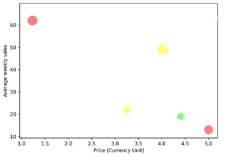
plt.scatter(
         x_data=[1.3,3.2,4.3,4.4,5],
         y_data=[62,22,18,50,12],
         c=[“red”, “yellow”, “yellow”, “green”, “red”]
         #setting the transparency value
          alpha=0.5,
)
#Adding label to the x-axis
plt.xlabel(“price(currency unit)”)
#Adding a label to the y-axis
plt.ylabel(“Average weekly sales”)
#displaying the scatter plot.
plt.show( )
Output: