Python Plotly
Introduction
A dynamic free software library is the Plotly Python library. This is a very useful tool for data visualization and effortlessly comprehending the information. Plotly network components are a high-level, user-friendly interface for Plotly. It can draw various visualizations, including scatter diagrams, lines, data bars, box diagrams, histograms, and pie diagrams.
So, why plotly is above other visualization tools or frameworks is certainly a question on everyone's mind. Here is the response:
We can identify any unusual events or abnormalities in many information points using Plotly's hover tool features.
It has a pleasing appearance and appeals to a variety of groups.
It enables us to customize our graphs completely, improving the significance and readability of our plot for users.
In this lesson, you'll discover how to use plot.ly to make a line chart. It can be thought of as an expanded substitute for matplotlib.
Environment Setup
Plotly can be installed via the PyPi source. Install plotly on a fresh virtual machine by using the pip program.
Utilizing Python's virtual environment functionality while installing a new module is always advised. In the folder you choose, the next statement builds a simulated environment.

Execute the activation script in the bin subdirectory as described here to enable the virtual environment that has been established.

As seen beneath, Plotly's Python package may now be installed utilizing the pip program.
Installing the Jupyter Notebook software, which provides an online interface to the Python interpreter, may also be a good idea.

You must first register on the platform, which may be accessed at https://plot.ly. By signing up at the following link: https://plot.ly/api_signup, you are capable of logging in.
Online & Offline Plotting
Online plotting methods
Online plot charts and data are saved to your plot.ly account. There are two ways to build online plots, and both produce a distinct url for the plot that is saved in your Plotly account.
- The distinct url is returned by py. plot(), which can also open the link.
- When using a Jupyter Notebook, use py. plot () to show the plot inside the notebook.
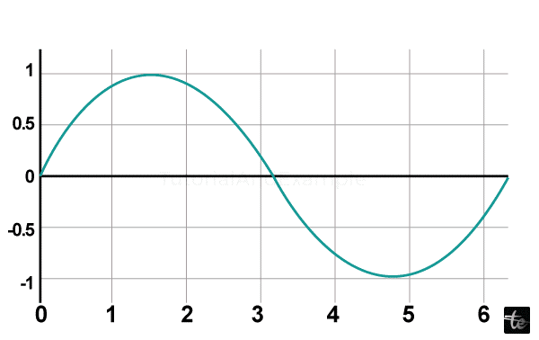
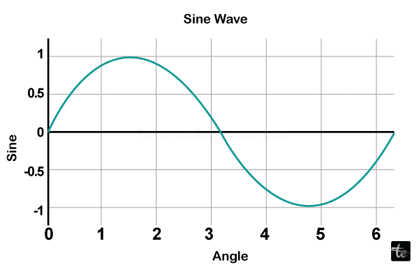
We'll now show a straightforward plot of the angle in radius versus sine value. Use the arange() method of the numpy library first to get a ndarray entity with angles spanning 0 and 2. This ndarray object represents the numbers that appear on the graph's x-axis. The following sentences are used to get the equivalent sine values of angles in x that must be shown on the y-axis.
Configuring Offline Plotting
You can create offline charts with Plotly and download them to a local computer. The standalone HTML produced by plotly. Offline. plot() method can be saved on your computer and displayed in your favorite web browser. When operating offline in a Jupyter Notebook, you can use plotly. offline. plot () to show the visualization in the notebook.
Two choices exist for offline plotting:
- Plotly.offline.plot() can generate independent HTML. You can access this file through a web browser.
- If you're using offline in a Jupyter Notebook, try plotly.offline.iplot().
import numpy as np

import math # essential to defining the value of pi

xp = np.arange(0, math.pi*2, 0.05)

yp= np.sin(xp)
Afterward, construct a scatter trace using the graph_objs module's Scatter () method.
t = go.Scatter(

   x = xp,

   y = yp

)

data = [t]
Use the preceding list object as the plot() function's input.
py.plot(data, filename = 'name of the file', auto_open=True)
Save the script below as plot.py:
import plotly

plotly. tools.set_credentials_file(username='user name', api_key='*******************')

import plotly. plotly as py

import plotly.graph_objs as go

import numpy as np

import math # essential to defining the value of pi

xp = np.arange(0, math.pi*2, 0.05)

yp = np.sin(x)

t = go.Scatter(

   x = xp, y = yp

)

data = [t]

py.plot(data, filename = 'name of the file', auto_open=True)
Output:
Plotting Inline with Jupyter Notebook
In the next part, we will learn how to use the Jupyter Notebook program for inline graphing
.
It would be best if you started Plotly's notebook mode by doing the following when viewing the plot throughout the notebook:
import plotly

plotly. tools.set_credentials_file(username = 'user name', api_key = '******')

from plotly.offline import iplot, init_notebook_mode

init_notebook_mode(connected = True)

import plotly

import plotly.graph_objs as go

import numpy as np

import math #needed for the definition of pi

xp = np.arange(0, math.pi*2, 0.05)

yp = np.sin(x)

trace0 = go.Scatter(

   x = xp, y = yp

)

data = [t0]

plotly. offline.iplot({ "data": data, "layout": go.Layout(title="Sine wave")
Output:
Plotly - Package Structure
The three primary modules of the Plotly Python package are listed below.
•Plotly. tools,
• Plotly.graph_obj,
• Plotly.Plotly
Plotly's servers are required for some functions in the plotly.plotly module. This module's functions act as a conduit connecting your local computer and Plotly. The most significant module, which includes all of the class declarations for the entities that compose the visualizations you see, is plotly.graph_objs. The graph items are described:
• Figure;
• Data;
•Layout;
Various graph traces, such as Scatter, Box, and Histogram.
The objects utilized to construct and edit each aspect of a Plotly plot are dictionary- and list-like elements known as graph objects.
Numerous helpful characteristics that facilitate and improve the Plotly encounter may be found in the plotly.tools module. The following module defines subplot generation after generation operations, integrating Plotly charts in IPython laptops, and saving and accessing your login information.
Figure object, referring to the Figure class specified in the plotly.graph_objs module depicts a plot. Its constructor requires the subsequent inputs:
import plotly.graph_objs as go

figure = go.Figure(data, layout, frames)
Plotly offers a variety of trace objects, including Scatter, bars, pies, heatmaps, and others. The correct function in the graph_objs methods provides each of these. For instance, A scatter trace is returned by go. Scatter ().
import numpy as np

import math # essential to defining the value of pi

xp=np.arange(0, math.pi*2, 0.05)

yp=np.sin(xp)

t0 = go.Scatter(

   x = xp, y = yp

)

data = [t0]
The layout option defines the plot's look and plot elements independent of the information. The title, axis titles, comments, legends, positioning, font, and even drawing images on top of the graph will all be modifiable.
l = go.Layout(title = "Sine wave", xaxis = {'title':'angle'}, yaxis = {'title':'sine'})
A plot may have both an axis title and a plot title. Comments that point to other information may also be present.
The last object made by Go is a figure.Figure() method. This object contains the data object and the arrangement object, which resembles a dictionary. In the end, the figure object is displayed.
Exporting to Static Images in Plotly
Offline graphs' outputs can be downloaded in several raster and vector image formats. Installing Orca and psutil, two connections are required for that.
Orca
Open-source Report Creator App is known as ORCA. The Electron application creates screenshots and overviews of visualizations, spark apps, and plotly graphs from an instruction line. The foundation of Plotly's Image Service is Orca.
psutil
(python system and process utilities) is a multi-platform module that allows Python programmers to retrieve details about running processes and system usage. Numerous features provided by UNIX command-line instruments, including ps, top, netstat, ifconfig, who, etc., are implemented. All current operating systems, including Linux, Windows, and Mac OS, are supported by Psutil.
Setting up of psutil with Orca
The conda package manager makes it easy to install Orca and Psutil while running the Anaconda distribution of Python.
conda install -c plotly plotly-orca psutil
You can set it up using the npm tool because Orca wasn't included in the PyPi repository.
npm install -g [email protected] orca
For the installation of psutil, utilise pip.
pip install psutil
Prebuilt versions of Orca are also accessible to download from the link provided at https://github.com/plotly/orca/releases if you cannot use npm or conda.
Integrate the plotly.io module before exporting the Figure object to the png, jpg, or WebP formats.
import plotly.io as pio
Currently, we may invoke the method write_image() using the syntax:
pio.write_image(figure, ‘sinewave.png’)

pio.write_image(figure, ‘sinewave.jpeg’)

pio.write_image(figure,’sinewave.webp)
Plotly publishing to the svg, pdf, and eps files is also supported by the Orca tool.
Pio.write_image(figure, ‘sinewave.svg’)

pio.write_image(figure, ‘sinewave.pdf’)
The image object generated by the pio.to_image() method can be presented inline within a Jupyter notebook as seen below:
Multiple trace Plotly charts typically display legends by default. If there is only one trace, it is not instantly displayed. Set the show legend attribute of the Layout class to True for it to show.
l= go.Layoyt(showlegend = True)
Trace object IDs are the default labels for legends. Set the name attribute of the trace to set the legend label specifically.
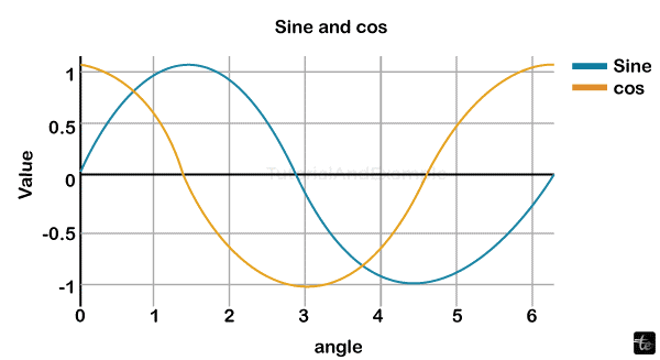
Two scattering traces using the name property are displayed in the following instance.
Code:
import numpy as np

import math # essential to the calculation of pi

xp = np.arange(0, math.pi*2, 0.05)

y1 = np.sin(xp)

y2 = np.cos(xp)

t0 = go.Scatter(

   x = xp,

   y = y1,

   name='Sine'

)

t1 = go.Scatter(

   x = xp,

   y = y2,

   name = 'cos'

)

data = [t0, t1]

layout = go.Layout(title = "Sine and cos", x-axis = {'title':'angle'}, y-axis = {'title':'value'})

figure = go.Figure(data = data, layout = l)

iplot(figure)
Output:

Plotly – Legends
Plotly allows us to edit the Legend's order, position, visibility (it can be shown or hidden), and other features like modifying its dimensions, typeface, and shade. Let's look at how we might modify the Legend in this post. The update_layout() function is used to customize Legend.
Multiple trace Plotly charts dynamically display legends by default. If there is a single trace, it isn't immediately presented. Set the show legend property of the Layout object to True for it to appear.
l = go.Layoyt(showlegend = True)
Trace names of objects are the default names for legends. Define the name attribute of the trace to set the legend label specifically. Two scattered traces with the name attribute are displayed in the following example.
Output:
import numpy as np

import math #

xp = np.arange(0, math.pi*2, 0.05)

Z1 = np.sin(xp)

Z2 = np.cos(xp)

t0 = go.Scatter(

   x = xp,

   y = Z1,

   n='Sine'

)

t1 = go.Scatter(

   x = xp,

   y = Z2,

   n= 'cos'

)

d = [t0, t1]

l= go.Layout(title = "Sine and cos", xaxis = {'title':'angle'}, yaxis = {'title':'value'})

figure = go.Figure(data = d, layout = l)

iplot(figure)
Output:
Format Axis and Ticks in Plotly
Each axis' look can be customized by choosing a line color and width. You can also specify the grid's width and color. In this chapter, let's discover more in-depth regarding this issue.
Plot with Axis and Tick
Ticks are enabled by altering showticklabels to true in the Layout object's attributes. A dict object with the tick font attribute specifies the font name, size, color, and other details. There are two possible options for the tick mode property: linear and array. If linear, tick0 determines the first tick's location, while tick characteristics define the step among ticks.
The Exponentformat property on the Layout object has additionally been configured with 'e', which will result in the presentation of tick numbers in scientific symbols. Changing the show exponent attribute to "all" would be best.
By giving the line, grid, and title font attributes and the tick setting, values, and font, we can now style the Layout element in the previous instance while setting the x and y axes.
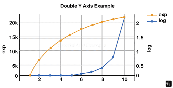
Plot with Several Axes
Dual x or y axes can be helpful in certain situations, such as when simultaneously charting curves with various units. Matplotlib's twins and tiny algorithms support this. The plot in the instance provided below contains two y axes, one displaying exp(x) and the other representing log(x).
Code:
x = np.arange(1,11)

Z1 = np.exp(x)

Z2 = np.log(x)

t1 = go.Scatter(

   x = x,

   y = Z1,

   n = 'exp'

)

t2 = go.Scatter(

   x = x,

   y = Z2,

   n = 'log',

   yaxis = 'Z2'

)

datavalues = [t1, t2]

l = go.Layout(

   t = 'Double Y Axis Example',

   yaxis = dict(

      title = 'exp',zeroline=True,

      showline = True

   ),

   yaxis2 = dict(

      title = 'log',

      zeroline = True,

      showline = True,

      overlaying = 'y',

      side = 'right'

   )

)

figure = go.Figure(data=datavalues, layout=l)

iplot(figure)
Output:
Plotly - Subplots & Inset Plots:
The capacity for viewers to swiftly analyze an enormous quantity of knowledge regarding data when moving their cursor over where a label emerges is one of the more surprisingly effective characteristics of Plotly data visualization.
Plotly is a potent Python library used to build dynamic visualizations pleasing to the eye. These visualizations can include several types of plots, including line charts, scatter diagrams, bar graphs, and more. You may organize the display of several visualizations by using techniques like complications and insert plots to group various graphs within a single figure.
Subplots:
A subplot is a plot that is a picture that has been divided into an arrangement of small plots, any of which show a distinct set of data or a subset of the same data. The make_subplots method within Plotly allows for simple construct subplots. Here is a simple illustration of how to make a grid that is two by two of subplots
Code:
import plotly.graph_objects as go

from plotly.subplots import make_subplots

# Using a 2x2 grid, construct subplots.

figure = make_subplots(rows=2, cols=2)

# For every subplot, include traces.

figure.add_trace(go.Scatter(x=[1, 2, 3], y=[4, 5, 6]), row=1, col=1)

figure.add_trace(go.Bar(x=[1, 2, 3], y=[2, 3, 1]), row=1, col=2)

figure.add_trace(go.Box(y=[10, 20, 15, 30]), row=2, col=1)

figure.add_trace(go.Histogram(x=[5, 5, 5, 10, 10, 15, 20]), row=2, col=2)

# Redesign the layout for improved appeal

figure.update_layout(title_text="Subplots Example")

figure.show()
Output:
Inset Plots:
An "inset" plot is a tiny plot inserted into the main plot. This method is frequently applied to offer in-depth details or zoomed-in views of particular data locations. Plotly enables you to add an image to the layout by applying the add_layout_image feature that can symbolize an inset plot.
import plotly.graph_objects as go

# Design the primary plot.

main_t = go.Scatter(x=[1, 2, 3, 4, 5], y=[10, 8, 6, 4, 2])

main_lay = go.Layout(title="Main Plot")

# Construct an independent trace for the inset plot.

inset_t = go.Scatter(x=[1.5, 2, 2.5], y=[8.5, 8, 7.5], mode="markers", marker=dict(size=10))

inset_lay = go.Layout(title="Inset Plot")

# Include a picture of the inset plot inside the main plot.

main_lay.images = [dict(

    source="path_to_inset_image.png",  # Way to go to the picture that represents the inset plot

    x=0.6, y=0.4,  # Structure in the primary plot

    xref=" paper", yref="paper",

    sizex=0.3, sizey=0.3  # The inset plot's dimension)]

#Make the representation, then add traces and layouts.

fig = go.Figure(data=[main_trace, inset_trace], layout=main_layout)

#Display the illustration.

fig.show()
These strategies can improve your capacity to meaningfully and informatively communicate complex material. Plotly provides various options for modification to precisely tailor the look and behavior of subplots and inset plots to your unique needs.
Plotly - Bar Chart & Pie Chart
Bar Chart
Using rectangular bars with heights or lengths equal to the values they symbolize, a bar chart displays information based on categories. Horizontal or vertical bar displays are both possible. Comparisons between distinct categories are useful. The comparison groups are shown on one axis of the chart, and the value measured is shown on the opposite axis.
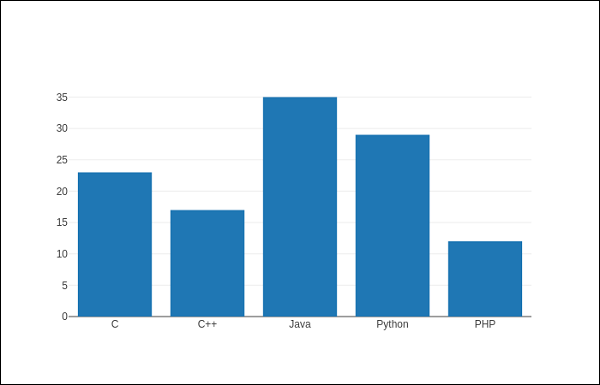
The following example displays a straightforward bar chart showing the number of students registered in various classes. The go. The Bar() method returns a bar trace with a list of subjects as its x coordinate and the number of pupils as the y coordinate.
Code:
import plotly.graph_objs as go

l = ['C', 'C++', 'Java', 'Python', 'PHP']

s = [23,17,35,29,12]

data = [go.Bar(

   x = l,

   y = s

)]

figure = go.Figure(data=data)

iplot(figure)

The result will appear as displayed below
Output:
The barcode attribute of the Layout class has to be changed to group to show an organized bar chart. Multiple traces indicating students in every academic year are compared versus subjects and displayed as a grouped bars chart in the code below.
Code:
branch= ['CSE', 'Mech', 'Electronics']

fy = [23,17,35]

sy = [20, 23, 30]

ty = [30,20,15]

t1 = go.Bar(

   x = branch,

   y = fy,

   name = 'FY'

)

t2 = go.Bar(

   x = branch,

   y = sy,

   name = 'SY'

)

t3 = go.Bar(

   x = branches,

   y = ty,

   name = 'TY'

)

d = [t1, t2, t3]

l = go.Layout(barmode = 'group')

figure = go.Figure(data = d, layout = l)

iplot(figure)
Output:
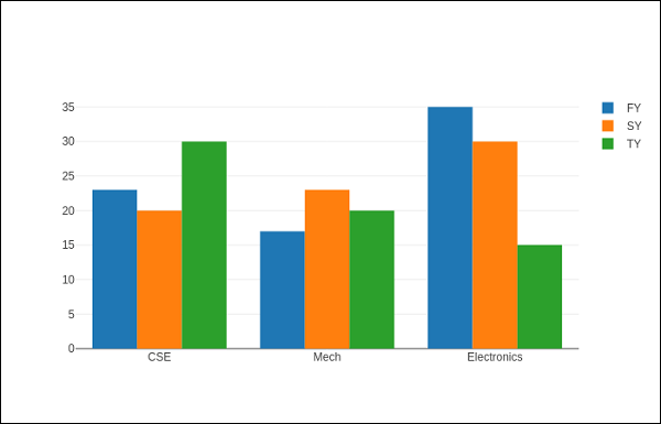
Whether bars with the same position value are presented on the graph depends on the bar mode attribute. The terms "stack" (bars layered in front of one other), "relative" (bars layered on top of each other, with values that are positive above the axes and negative ones below the axis), and "group" (bars plotted adjacent to one other) have definitions meanings.
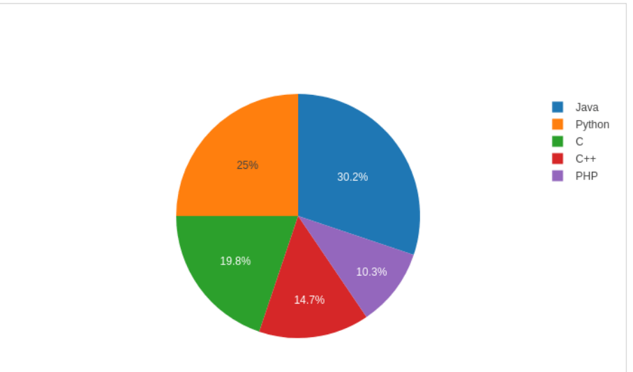
Pie graph
A single set of data is shown on a pie chart. Pie graphs display the proportional size of objects (referred to as wedges) inside a single information set. The proportion of the entire pie is displayed for every data point
Code:
import plotly

plotly. tools.set_credentials_file(

   user = 'lathkar', api_key = ‘******'

)

from plotly.offline import iplot, init_notebook_mode

init_notebook_mode(connected = True)

import plotly.graph_objs as go

l = ['C', 'C++', 'Java', 'Python', 'PHP']

s = [23,17,35,29,12]

t = go.Pie(labels = l, values = s)

data = [t]

figure = go.Figure(data = d)

iplot(figure)
Output:
Plotly - Scatter Plot, Scattergl Plot & Bubble Charts
The details of the Scatter Plot, Scattergl Plot, and Bubble Charts are highlighted in the next section.
Let's first learn about the scatter plot.
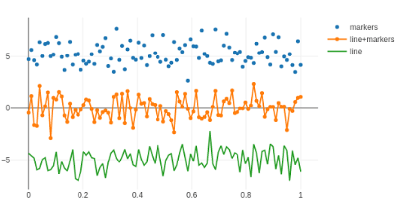
Scatter Plot
Points of data are plotted on the vertical and horizontal axes using scatter diagrams to demonstrate how factor influences one another. The symbol for every column in the information table is the numbers in the rows set up on the X and Y axes to determine its position.
A scattered trace is produced via the graph_objs module's Scatter () function (go. Scatter). In this, the style attribute controls how data points look. The mode's initial setting is lines. This depicts an unbroken line joining the data elements. Markers, then simply the data. The ends are depicted as tiny, filled circles when an option is chosen.
The scatter effects of all three sets of freely produced points are plotted in a coordinate system based on Cartesian geometry in the instance below. Below is an explanation of each trace with an alternate mode parameter.
Code:
import plotly

plotly. tools.set_credentials_file(

   user = 'lathkar', api_key = ‘******'

)

from plotly.offline import iplot, init_notebook_mode

init_notebook_mode(connected = True)

import plotly.graph_objs as go

l = ['C', 'C++', 'Java', 'Python', 'PHP']

s = [23,17,35,29,12]

t = go.Pie(labels = l, values = s)

data = [t]

figure = go.Figure(data = d)

iplot(figure)
Output:
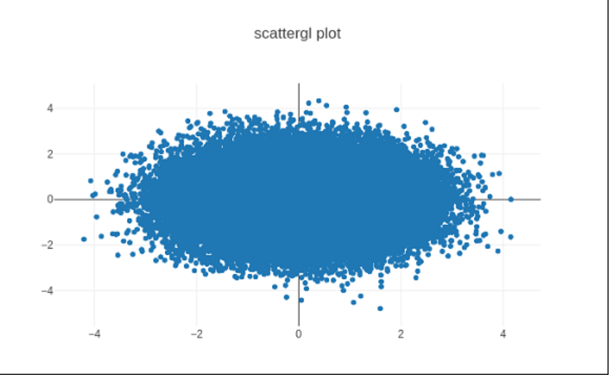
Spreadgl Plot
Eliminating the need for plug-ins, every compatible internet browser may render dynamic 2D and 3D images using the WebGL (Web Graphics Library) JavaScript API. Due to WebGL's complete integration into additional internet protocols, processing images may now be used with Graphics acceleration.
Scatter() may be replaced in Plotly with Scattergl() for faster performance, better interaction, and a capacity to plot much more data. When many indicators are involved, the power source goes. scattergl() technique performs well.
Code:
import numpy as np

K= 100000

x = np.random.randn(K)

y = np.random.randn(K)

   t0 = go.Scattergl(

   x = x, y = y, m = 'markers'

)

d= [t0]

l = go.Layout(title = "scattergl plot ")

figure = go.Figure(data = d, layout = l)

iplot(figure)
Output:
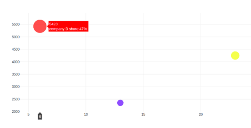
Bubble charts
The bar() functioning, which can be utilized for MATLAB-style use or as an Object-Based API, is offered by the matplotlib Python Interface. The bar() method has the following syntax when executed with axes:
plt.bar(x, bar height , bar width, bar bottom, alignment)
A bubble chart shows data in three different directions. Each thing is represented as a disc (bubble) representing one of its parameters via the disk's xy position and the third via its size. Each item has three levels of connected data. The values in the final data series are used to calculate the diameters of the bubbles.
| Company name | Products number | Sale | Division |
| X | 16 | 2789 | 56 |
| Y | 68 | 5893 | 07 |
| Z | 28 | 2456 | 80 |
A bubble graph is a variant of a scatter plot whereby bubbles are used in place of the data points. As illustrated below, a bubble chart is suitable if the information has multiple dimensions.
Utilizing the go.Scatter() trace, a bubble chart is created. Two of the data above series have x and y attributes supplied. The third aspect's marker represents the third data series' length. In the scenario above, we employ the x and y attributes of goods and revenue to determine the market share size.
The Jupyter Notebook should include the following lines of code.
Code:
company name = ['X',' Y',' Z']

products number = [16,68,,28]

sale = [2789,5893,2456]

division = [56,07,80]

figure = go.Figure(data = [go.Scatter(

   x = products name, y = sale,

   text = [

      'companyname:'+c+' division:'+str(s)+'%'

      for c in companycompanyname for s in share if companyname.index(c)==division. index(s)

   ],

   m= 'markers',

   ms = division, mc = ['blue', 'red', 'yellow'])

])

iplot(figure)
Output:
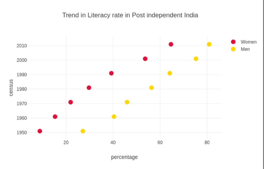
Plotly - Dot Plots and Table
Dot Plots
Points are shown on a very basic scale in a dot plot. Usually, a modest quantity of data can be used with it because excess points will render it appear cluttered. Cleveland point plots are another name for dot plots. They demonstrate differences between multiple situations or time points.
Comparable to a vertical bar chart are dot plots. They may, however, be simpler to navigate and make comparing conditions easier. The dispersed trace in the figure is shown with the mode parameter set to markings.
The following sample examines the literacy rates for men and women as reported in each census conducted in India since independence. The proportion of literate men and women in each census from 1951 to 2011 is shown by two traces in the graph.
Code:
from plotly.offline import iplot, init_notebook_mode

init_notebook_mode(connected = True)

c = [1952,1963,1979,1971,1981,2009, 2011]

xaxis1 = [8.8, 15.5, 21.7, 29.6, 39.2, 53.7, 64.3]

xaxis2 = [27.15, 40.40, 45.96, 56.38,64.13, 75.26, 80.88]

tA = go.Scatter(

   x = xaxis1,

   y = c,

   m = dict(color = "crimson", size = 12),

   mode = "markers",

   name = "Women"

)

tB = go.Scatter(

x = xaxis2,

y = c,

m = dict(color = "gold", size = 12),

mode = "markers",

name = "Men")

d= [tA, tB]

l= go.Layout(

   title = "Trend in Literacy rate in Post independent India",

   xaxis_title = "percentage",

   yaxis_title = "census"

)

Figure = go.Figure(data = d, layout =l)

iplot(figure)
Output:
Plotly table
The go.Table() method returns a Plotly's Table object. A table trace is a handy graph object for seeing comprehensive information in organized rows and columns. The grid is shown as an array of column values since the data table has a columns-major arrangement.
Two crucial go factors. The header is the initial row of the table's contents, and the remaining rows are formed by the cells in the Table() method. Dictionary objects make up both variables. A collection of column headings plus a list of lists, each matching to a row together, make up the values property of headings.
The variables such as colorOfLine, colorOfFill, font, and others allow for more stylistic adjustment.
The scoring table for the just-finished Cricket World Championship 2019's preliminary stage is displayed with a particular code.
Code:
race = go.Table(

   header = dict(

      values = ['Teams','Mat','Won','Lost','Tied','NR','Pts','NRR'],

      colorOfLine = 'gray',

      colorOfFill = 'lightskyblue',

      align = 'left'

   ),

   cells = dict(

      v =

      [

         [

            'India',

            'Australia',

            'England',

            'New Zealand',

            'Pakistan',

            'Sri Lanka',

            'South Africa',

            'Bangladesh',

            'West Indies',

            'Afghanistan'

         ],

         [9,9,9,9,9,9,9,9,9,9],

         [7,7,6,5,5,3,3,3,2,0],

         [1,2,3,3,3,4,5,5,6,9],

         [0,0,0,0,0,0,0,0,0,0],

         [1,0,0,1,1,2,1,1,1,0],

         [15,14,12,11,11,8,7,7,5,0],

         [0.809,0.868,1.152,0.175,-0.43,-0.919,-0.03,-0.41,-0.225,-1.322]

      ],

      colorOfLine ='gray',

      colorOfFill ='lightcyan',

      align='left'

   )

)

d = [t]

figure = go.Figure(data = d)

iplot(figure)
Output:
Now that we have created a dataframe object using this spreadsheet file, we will utilise it to create a table trace as seen following.
import pandas as pd

d = pd.read_csv(tablename.csv')

t = go.Table(

   header = dict(values = list(d.columns)),

   cells = dict(

      vs = [

         d.Teams,

         d.Matches,

         d.Won,

         d.Lost,

         d.Tie,

         d.NR,

         d.Points,

         d.NRR

      ]

   )

)

data = [trace]

fig = go.Figure(data = data)

iplot(fig)
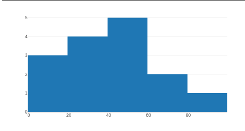
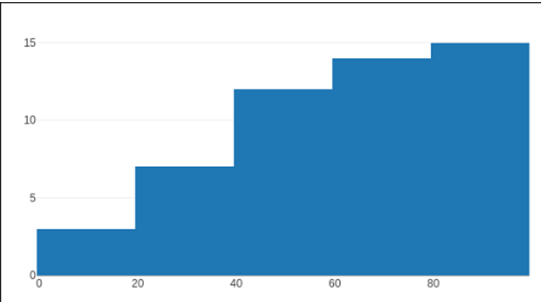
Plotly – Histogram
A histogram, which Karl Pearson initially developed, precisely illustrates the arrangement of numeric data and predicts the probability distributions of a constant variable (CORAL). Although it resembles a bar chart, a histogram only correlates a single indicator, as the bar chart correlates two.
A bin (or bucket) is needed to partition the entire spectrum of items into an assortment of quarters and then calculate the number of values that fit into every interval to create a histogram. The bins are often defined as separate periods that don't overlap. Bins must be next to each other and are frequently the same size. The width of a rectangular shape covering the bin is determined by the rate of occurrence or the total quantity of incidents in each bin.
Go provides a histogram trace object as a result.function histogram(). It can be customized using several inputs or characteristics. It is capable of being adjusted based on a variety of sources or traits. One of the necessary parameters must be X or Y, which must be provided to a list of candidates, numpy array, or pandas data frame containing an object that will be split into bins.
Plotly autonomously sized bins are how the data elements are typically distributed. You have the option to specify an individual bin size. You must specify nbins (the number of bins), their beginning and ending values, and size and set auto bins to false.
The code below creates a straightforward histogram that displays the overall distribution of pupils' grades within a class in bins (with diameters dynamically).
Code:
import numpy as np

x = np.array([22,87,5,43,56,73,55,54,11,20,51,5,79,31,27])

data = [go.Histogram(x = x)]

figure = go.Figure(data)

iplot(figure)
Output:
The type of normalization applied to this graphic trace is specified by the history parameter, which the go accepts.Histogram() method. The overall number of incidences (i.e., the number of information points falling within the bins) is represented by the width for each bar, which is by definition ", and it is ". Each bar's span, if "percent" or "probability" is specified, represents the proportion of incidences relative to the overall amount of points from the sample. The width of every bar, if "density" is the same, is proportional to the ratio of the number of incidents in a bin to the measurement of that bin gap.
There is also a reflective variable; the count is its default value. Thus, the length of the rectangle above a bin represents the number of data points. The options are sum, average, minimum, or maximum.
You can configure the histogram() method to show the average data distribution in subsequent bins. You must activate the aggregate attribute to do it. The outcome is shown below.
Code:
d=[go.Histogram(x = Z1, cumulative_enabled = True)]

figure = go.Figure(d)

iplot(figure)
Output:
Plotly - Box Plot Violin Plot and Contour Plot
The detailed study of numerous plots, particularly the box plot, violin plot, contour plot, and arrow plot, is the main topic of the next section. We'll start by following the box plot.
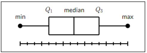
Box Plot
A box plot shows the smallest value, first quartile, median, third quartile, and highest of a data collection. A box is drawn across the first percentile to the third group in a line graph. At the center, a straight line divides the box. Whiskers were the straight lines that emerged from the boxes representing variation beyond the top and bottom quartiles. Therefore, "box plot" refers to "box and whisker plot." Every quartile's whiskers lead to its smallest or utmost.
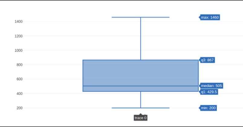
Use of the go.The box () method is required to create a Box chart. The x or y variable can be chosen for the data series. The box graph will, therefore, be displayed in either direction or vertically. The following scenario transforms sales data from a particular business's multiple locations into a horizontal box plot. The standard deviation of the least and maximum values is displayed.
Code:
t1 = go.Box(y = [1140,1460,489,594,502,508,370,200])

d = [trace1]

figure = go.Figure(d)

iplot(figure)
Output:
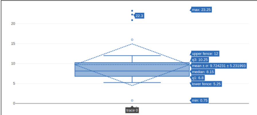
Additional arguments can be passed to the go-to to alter a box plot's look and functionality.Box() method. The boxmean variable is one example.
By generally, the boxmean argument is set to true. As an outcome, the true distribution of the boxes' mean is depicted as a dashed line within each box. A distribution's average value is also displayed if it has been changed to sd.
The value "outliers" is the standard setting for the box points argument. It only displays the collection of points beyond the edges of the whiskers. When "suspectedoutliers" are present, outlier values are displayed, and those that fall within the range of 4"Q1-3"Q3 or more than 4"Q3-3"Q1 are underlined. If "False", just the selected box(es) and no actual sample points are displayed.
The instance below illustrates the box trace with the standard variance and outlier locations.
Code:
t = go.Box(

   z = [

      0.75, 5.25, 5.5, 6, 6.2, 6.6, 6.80, 7.0, 7.2, 7.5, 7.5, 7.75, 8.15,

      8.15, 8.65, 8.93, 9.2, 9.5, 10, 10.25, 11.5, 12, 16, 20.90, 22.3, 23.25

   ],

   boxpoints = 'suspectedoutliers', boxmean = 'sd'

)

d = [t]

figure = go.Figure(d)

iplot(figure)
Output:
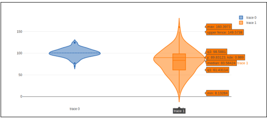
Violin Plot
Comparable to box plots, violin plots also display the information's probability density at various values. Like conventional box plots, violin graphs include a box denoting the interquartile range and an asterisk for the information median. A kernel prediction of density is displayed superimposed on this box graphic. Like box plots, violin plots compare a variable production (or sample distribution) and other "categories".
An instructive violin plot is superior to a straightforward box plot. The violin plot displays every data dimension, whereas a box plot displays basic information like mean/median and interquartile levels.
The graph_objects module's go.Violin() method returns a violin trace entity. The boxplot_visible parameter has been modified to True to show the fundamental box plot. According to this, a line representing the sample's average is displayed in the violins when the meanline_visible attribute is configured to true.
The instance below shows plotly's capabilities to present a violin plot.
Code:
import numpy as np

np.random.seed(10)

d1 = np.random.normal(100, 10, 200)

d2 = np.random.normal(80, 30, 200)

t1 = go.Violin(y = d1, meanline_visible = True)

t2 = go.Violin(y = d2, box_visible = True)

data = [t1, t2]

figure = go.Figure(data = d)

iplot(figure)
Output:
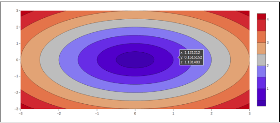
Contour plot
The contoured lines of a two-dimensional numeric array z, or interpolation lines of z's isovalues, are displayed in a two-dimensional contour plot. A contour line of a two-variable expression is an arc connecting locations with an identical value throughout which the resultant function is unchanged.
A contour chart is the right choice to visualize how the number Z varies as an expression between two inputs, X and Y, with a value Z = f(X,Y). An isoline or contoured line is a curve through which an equation with both variables has an unchanged value.
Typically, the variables that are independent x and y are constrained to a meshgrid that is a normal grid. The numpy produces a rectangular grid.meshgrid using a collection of x coordinates and y variables.
Let's start by utilizing the linspace() method from the Numpy package to construct data parameters for x, y, and z. By using x and y values to generate a meshgrid, we can get a z array of the squared roots of x2 and y2.
We must leave. The graph_objects module's contour() method accepts the x, y, and z variables. The following code excerpt shows the contour diagram of the above-calculated x, y, and z variables.
Code:
import numpy as np

alist = np.linspace(-3.0, 3.0, 100)

blist = np.linspace(-3.0, 3.0, 100)

X1, Y1 = np.meshgrid(alist, blist)

Z 1= np.sqrt(X1**2 + Y1**2)

t = go.Contour(x = alist, y = blist, z = Z1)

d = [t]

figure = go.Figure(d)

iplot(figure)
Output:
The options that follow can be used to alter the contours of the plot:
The boolean function inversion flips the z data.
The a/b parameters are provided by "a"/"b" if either xtype (or ytype) is "array". If "scaled", "x0" and "dx" provide the a dimensions.
- Whether or not the spaces in the z information have been plugged in depends on the connectgaps option.
- The contours parameter's default setting is 15. The actual amount of contours will be predetermined to be fewer than or equivalent to the numerical value 'ncontours'. It only impacts if "autocontour" is set to "True."
The data is rendered as a contour plot having many levels presented because the standard contours kind is "levels". If there is a limitation, the information is shown as limitations, with the erroneous section colored according to the specifications for operations and value.
Showlines regulate the extent to which the contour lines have been created.
Zauto controls whether the color domains are determined concerning the data being entered (in this case, in 'c') or the constraints set in 'cmin' and 'cmax'. By standard, it has the value True. When the individual configure 'cmin' and 'cmax', the value defaults to 'False'.
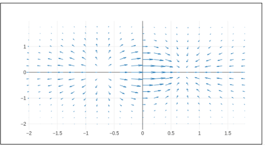
Quiver plot
Velocity plot is another name for the quiver plot. It shows velocity matrices as strokes with (d,e) constituents at the (a,b) coordinates. We'll use the create_quiver() method from Plotly's figure_factory package to construct the Quiver plot.
The freely available diagramming library plotly.js has yet to incorporate all of the custom chart kinds that may be created using the graph factory module of Plotly's Python Interface.
The inputs that the create_quiver() method requires are as follows:
- measurements of the arrow sites are x and x.
- Placement of the arrows' y-y integers
- elements of the arrowhead vector with u and x
- constituents of the arrowhead vectors' v and y axes
- This scales the arrows' size.
- dimension of the arrowhead = arrow_scale.
- angling arrowhead angle.
Code:
import plotly.figure_factory as ff

import numpy as np

a,b = np.meshgrid(np.arange(-2, 2, .2), np.arange(-2, 2, .25))

c = a*np.exp(-a**2 - b**2)

d,e = np.gradient(c, .2, .2)

#Construct a quiver figure.

figure = ff.create_quiver(a,b,d,e)

scale = .25, arrow_scale = .4,

name = 'quiver', line = dict(width = 1))

iplot(figure)
Output:
Plotly - Distplots, Density Plot, and Error Bar Plot
The next section will learn in-depth information about distplots, density plots, and error bar graphs. Let's start by studying distplots.
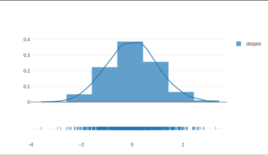
Distplots
The distplot figure manufacturer shows a variety of mathematical depictions of numerical information, including rug plot, kernel density, and histogram.
The three elements that follow can be included in any number of combinations in the distplot:
Histogram distribution options include a standard curve, rug plot, or kernel concentration estimate.
The create_distplot() method in the figure_factory package requires the hist_data argument as a required argument.
The basic distplot created by the source code below includes a series of histograms, a KDE plot, and an area plot.
Code:
y= np. random.randn(100)

historydata = [y]

grouplabels = ['distplot']

figure = ff.create_distplot(historydata, grouplabels)

iplot(figure)
Output:
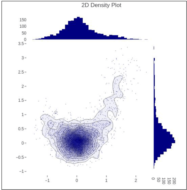
Density Plot
A density plot is a persistent, smoothing variant of a histogram derived from the information. Kernel density computation (KDE) is the most used type of estimate. The technique involves drawing a continuous line (the kernel) for each unique data point and then adding all of those lines to create a single, consistent density calculation.
Code:
s= np.linspace(-1, 1.2, 2000)

a = (t**3) + (0.3 * np.random.randn(2000))

b = (t**6) + (0.3 * np.random.randn(2000))

figure = ff.create_2d_density( a,b)

iplot(figure)
Output:
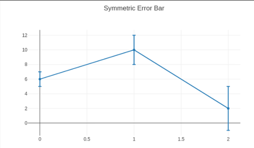
Error Bar Plot
Inaccuracy bars are graphical indications of data ambiguity or inaccuracy that help with precise interpretation. Accounting for mistakes is essential for comprehending the available data for scientific research.
Since the bars of error display the trust or accuracy in a collection of observations or computed values, they are helpful for problem solvers.
Error bars often show a data set's spectrum and average. They can aid in illuminating the data distribution about the average value. On several plots, including bar graphs, line graphs, scatter graphs, etc., bars for error can be produced.
The warning_x and warning_y attributes of the go. The scatter () function regulates the generation of bars of error.
Controls the extent to which this collection of bars of error is visible (boolean)
The type attribute has the following potential principles: percentage, stable, sqrt, and data. It establishes a procedure for producing the erroneous bars. The bar widths represent an amount of the data underneath if "percent" is selected. Put this % in the value field. The rectangular bar lengths match the rectangular shape of the data underneath if "sqrt" is selected. If "data," the information set "array" is used to set the bar widths.
Either the symmetric property is true or false. As a result, the error bars (top/bottom for vertical bars and left/right for horizontal bars) will be the same length in both directions or not.
The array specifies the data corresponding to each error bar's length. Plots of values are compared to the underlying data. array minus sets the data for each error bar's length in the bottom (left) direction. The scatter chart displayed by the subsequent code has symmetrical bars for errors.
Code:
t= go.Scatter(

   a = [0, 1, 2], b= [6, 10, 2],

   error_b = dict(

   type1 = 'data', # value of error bar given in data coordinates

   array1 = [1, 2, 3], visible = True)

)

data = [tracee]

layout = go.Layout(title = 'Symmetric Error Bar')

figure= go.Figure(data = data, layout = layout)

iplot(figure)
Output:
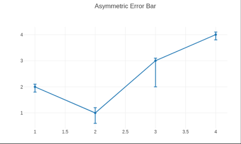
Code:
An asymmetrical failure plot is produced using the script below.
tracee = go.Scatter(

   a= [1, 2, 3, 4],

   b =[ 2, 1, 3, 4],

   error_b= dict(

      type1= 'data',

      symmetric = False,

      array1 = [0.1, 0.2, 0.1, 0.1],

      array1minus = [0.2, 0.4, 1, 0.2]

   )

)

data = [trace]

layout = go.Layout(title = 'Asymmetric Error Bar')

figure = go.Figure(data = data, layout = layout)

iplot(figure)
Output:
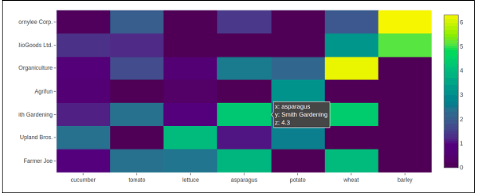
Plotly - Heatmap
Heat Maps help users focus on the parts of data visualizations that matter most by helping to better.Each number found in a matrix of values can be seen as colors in a heat map, which is a visual representation. visualise the amount of locales and events inside a set of data.
Heat maps frequently give a broader picture of quantitative numbers since they rely on color to express values. Heat illustrations are adaptable and effective at highlighting trends, so they are growing popular among intelligence professionals.
Inherently straightforward are heat maps. The amount increases with the shade's darkness (i.e., the higher the quantity, the more compact the dispersion, etc.). Heatmap() is an operation in the graph_objects package of Plotly. It requires a, b, and c qualities. A list, numpy array, or Pandas data frame can be used as a parameter.
In the following instance, the data (harvest by various farmers expressed in tons/year) is defined in a 2D list or array for color coding. The titles of both lists of agriculturalists and the vegetables they grow are also required.
Code:
vegetables = [

   "Cucumber",

   "Wheat ",

   "Lettuce",

   "Asparagus",

   "Potato",

   "Tomato ",

   "barley"

]

agriculturalists = [

   "Farmer Joe",

   "Upland Bros.",

   "Smith Gardening",

   "Agrifun",

   "Organiculture",

   "BioGoods Ltd.",

   "Cornylee Corp."

]

harvesting = np.array(

   [

      [0.8, 2.4, 2.5, 3.9, 0.0, 4.0, 0.0],

      [2.4, 0.0, 4.0, 1.0, 2.7, 0.0, 0.0],

      [1.1, 2.4, 0.8, 4.3, 1.9, 4.4, 0.0],

      [0.6, 0.0, 0.3, 0.0, 3.1, 0.0, 0.0],

      [0.7, 1.7, 0.6, 2.6, 2.2, 6.2, 0.0],

      [1.3, 1.2, 0.0, 0.0, 0.0, 3.2, 5.1],

      [0.1, 2.0, 0.0, 1.4, 0.0, 1.9, 6.3]

   ]

)

t = go.Heatmap(

   a = vegetables,

   b = agriculturalists,

   c = harvesting,

   type = 'heatmap',

   colorscale = 'Viridis'

)

d= [t]

figure = go.Figure(data = d)

iplot(figure)
Output:
Plotly - Polar Chart and Radar Chart
Polar Chart
Circular graphs frequently take the form of Polar Charts. It is advantageous when interactions among variables can be represented simplest in radii and angles.
A series is depicted in polar charts as a closed curve connecting points in the polar coordinate system. The radial coordinate—the distance towards the pole—and the angular coordinate—the angle along the fixed direction—determine each data point.
Data are displayed on radial and angular axes in polar charts. The radial and angular positions are provided considering the r and theta inputs for go. Function scatterpolar(). Although numerical data is more prevalent and may be descriptive and classified, it is also possible with theta data.
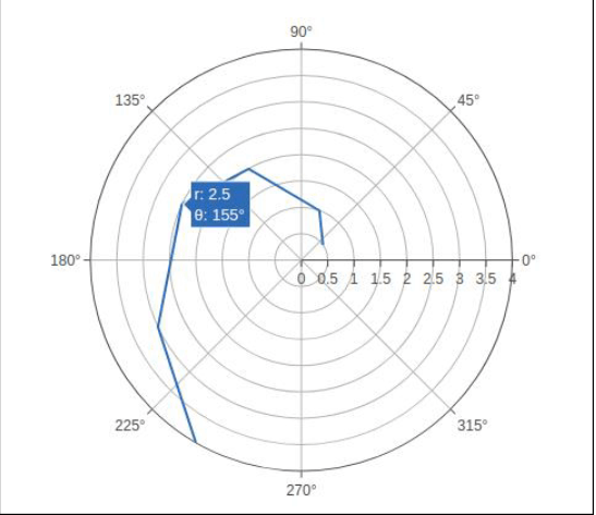
A simple polar graph is produced by the code below. We set the mode to columns and to the variables r and t (it can also be set to indicators, in which instance only the information from the lines will be the ones that are presented).
Code:
import numpy as np

r = [0,6,12,18,24,30,36,42,48,54,60]

t = [1,0.995,0.978,0.951,0.914,0.866,0.809,0.743,0.669,0.588,0.5]

traces = go.Scatterpolar(

   r = [0.5,1,2,2.5,3,4],

   t = [35,70,120,155,205,240],

   mode = 'line',

)

data = [traces]

figure = go.Figure(data = data)OZ
Output:
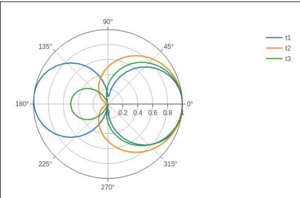
In a following instance, the polar graph is created using information from a CSV file with comma-separated numbers. The polar.csv file's first few lines are listed below:
y,a1,a2,a3,a4,a5,
0,1,1,1,1,1,,
12,0.978,0.989,0.984,0.993,0.986,
, 18,0.951,0.976,0.963,0.985,0.969
24,0.914,0.957,0.935,0.974,0.946,
30,0.866,0.933,0.9,0.96,0.916,
36,0.809,0.905,0.857,0.943,0.88,
6,0.995,0.997,0.996,0.998,0.997,
48,0.669,0.835,0.752,0.901,0.792,
54,0.588,0.794,0.691,0.876,0.74,
60,0.5,0.75,0.625,0.85,0.685,
To create the northern chart below, paste the code following the script into the notebook's source cell.
Output:
import pandas as pd

df = pd.read_csv("polar.csv")

s1 = go.Scatterpolar(

   r1 = df['a1'], theta = df['y'], mode = 'lines', name = 'a1'

)

S2 = go.Scatterpolar(

   r2 = df['a2'], theta = df['y'], mode = 'lines', name = 'a2'

)

s3 = go.Scatterpolar(

   r3= df['a3'], theta = df['y'], mode = 'lines', name = 'a3'

)

data = [s1,s2,s3]

figure = go.Figure(data = data)

iplot(figure)
Output:
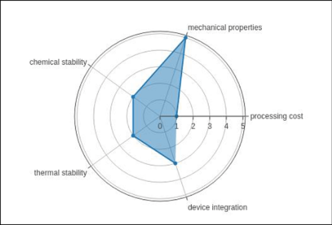
Radar diagram
A radar chart, often referred to as a spider graph or stars plot is a two-dimensional diagram showing quantitative factors as they appear on axes that radiate outward away from the center. Usually, the related axes' location nor angle are meaningless.
Overview
The radar map is a diagram and graphic of radii—a series of equiangular spokes—each representing one of the parameters. Concerning the greatest magnitude of the variables throughout the entire data set, the informational lengths of a spoke are related to the overall magnitude of the characteristic for the particular data point. Everyone spoke's data values are connected by a line. This lends the narrative a star-like look and is the source of one of the plot's well-known names. The inquiries that follow can be addressed using the central character plot:
Use the polar chart with category horizontal parameters in Go to create the radar chart.Scatterpolar() method for the most common scenario.
The simple radar chart shown below uses the Scatterpolar() algorithm.
Code:
radar = go.Scatterpolar(

   r1 = [1, 5, 2, 2, 3],

   t = [

      'Thermal stability

      'mechanical properties,

      'processing cost'

      'chemical stability,

      'thermal stability,

      'Device integration'

   ],

   fill = 'toself'

)

data = [radar]

figure = go.Figure(data = data)

iplot(figure)
Applications:
By computing numerous player-related information that can be traced along the center line of the chart, radar charts may be employed in sports to record players' advantages and shortcomings. Examples are a basketball, the player's made shots, recovers, contributions, etc., or a professional sports player's striking or inning statistics. When combined with comparable performers' statistics or league-typical values, this produces a centralized visualization of a player's advantages and disadvantages that can show how a player thrives and how they can develop.
The ability for instructors and coaches to modify the player's training program to help them develop their shortcomings is made possible by this knowledge about a player's strengths and limitations. A radar chart's findings can be helpful in tactical play as well. The opponent may aim to manufacture a circumstance wherein the player is compelled to hit facing the starter if a batter seems to hit poorly against disadvantaged pitching; in this case, his club knows to minimize his plate experiences versus disadvantaged pitchers. Consumers may consider aspects like the top acceleration, gas mileage, power, and torque of the vehicles. They may choose the ideal vehicle for them according to what they know after utilizing a chart with radar to visualize it.
OHLC Chart, Waterfall Chart, and Funnel Chart
This section focuses on three additional types of charts that may be created with Plotly, namely OHLC, Waterfall, and Spiral Charts.
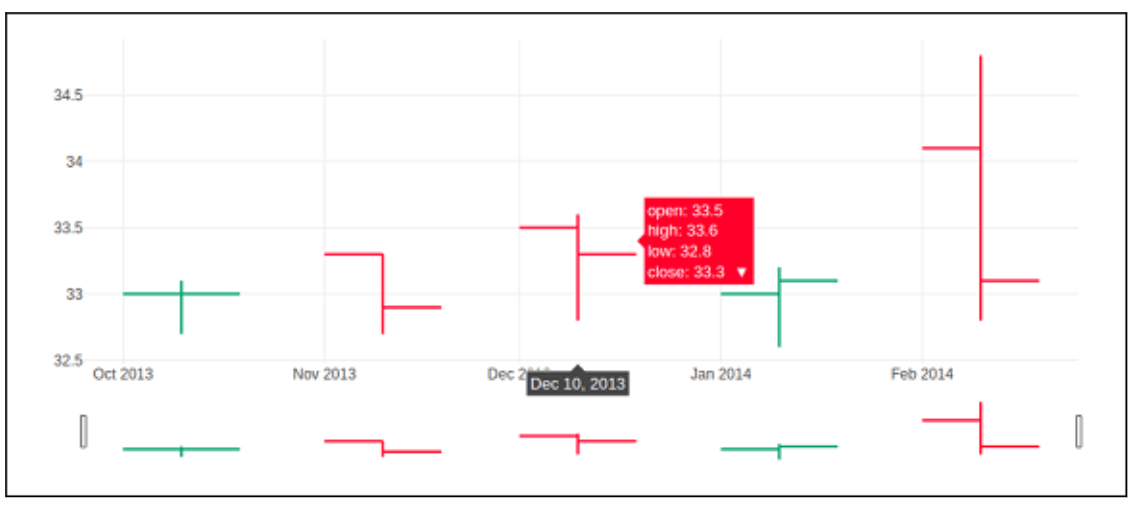
OHLC Chart
A form of bar diagram called an open-high-low-close chart (also known as an OHLC chart) is frequently used to show price changes of securities like equities. THESE CHARTS ARE HELPFUL since OHLC diagrams display the four main data points over time. The graph type is helpful since it can display growing or diminishing velocity. Evaluating variance using both the high and low points in the data is helpful.
On the graph, every vertical line represents the range of costs (the greatest and cheapest prices) for a specific period, such as a day or an hour. Indicating the price at the beginning (for a daily bar chart, this signifies the initial cost for that day) on the left with the final sale price for the entire time frame on the right of the chart are tick marks that extend from one end to the other of the line.
Below are some illustrations for an OHLC chart presentation. According to the matching date strings, it has list items for high, low, open, and close values. Using the strip () technique obtained from the period module, the date-based version of a string is transformed into integer objects.
opendata = [33.0, 33.3, 33.5, 33.0, 34.1]

highdata = [33.1, 33.3, 33.6, 33.2, 34.8]

lowdata = [32.7, 32.7, 32.8, 32.6, 32.8]

closedata = [33.0, 32.9, 33.3, 33.1, 33.1]

datedata = ['10-10-2013', '11-10-2013', '12-10-2013','01-10-2014','02-10-2014']

import date_time

dates = [

   date_time.date_time.strp_time(datestr, '%m-%d-%Y').date()

   for datestr in datedata

]
For public, high, low, and closed variables necessary for going, we must utilize a date object from above as the argument.OHLC t is returned by the ohlc() algorithm.
Code:
t = go.Ohlc(

   a= dates,

   open = opendata,

   high = highdata,

   low = lowdata,

   close = closedata

)

data = [t]

figure = go.Figure(data = data)

iplot

(figure)
Output:
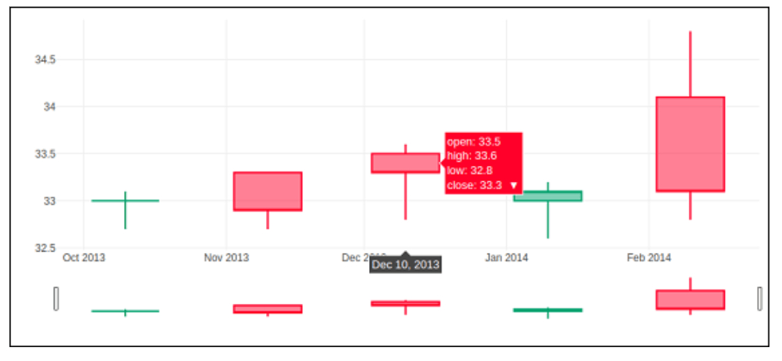
Candlestick Chart
Most of the time, technical evaluation of equities and foreign price trends use candlestick graphs. The opening price, ending price, high, and low during that time frame are used by investors to forecast potential price movements based on historical trends.[Reference needed] Box plots are visually appealing and aesthetically look similar. However, box plots display distinct material.[2]
Both the candlestick chart and the OHLC chart are comparable. It resembled a mashup of a line chart and a bar chart. The containers show the difference between the open and shut values, while the dotted lines represent the distance between the high and low figures. Growing (decreasing) sample points are those whose closed value is greater (lesser) than the initially displayed number.
The go. The candlestick () method returns an empty candlestick tracing. We created the candle stick graph below using the same information as for the OHLC graph.
Code:
t = go.Candlestick(

   a= dates,

   open = opendata,

   high = highdata,

   low = low data,

   close = closedata

)
Output:
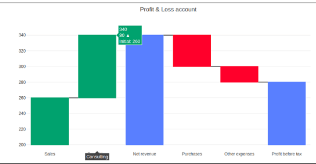
Waterfall chart
A cascade of water chart, sometimes referred to as a flying brick chart or a Mario chart, aids in comprehending the cumulative effect of successively added positive or negative values that may be time- or category-based.
The separate negative and positive modifications appear as floating steps, and the beginning and end quantities are displayed as columnar. Some waterfalls charts join the vertical lines that separate the rows and columns to give the impression that the diagram is a footbridge.
Assess, a further characteristic, is a collection of many value kinds. All values are assumed to be local by definition. To calculate the totals, set it to 'total'. If it equals definitive, the calculated total is reset, and a starting point is declared if necessary. The 'base' property determines the bar basis's location (in position axis units).
Code:
t 1=[

   "Sales",

   "Other expenses",

   "Net revenue",

"Consulting",

   "Purchases",

   "Profit before tax"

]

s2 = [60, 80, 0, -40, -20, 0]

trace = go.Waterfall(

   a = t1,

   b = t2,

   base = 200,

   measure = [

      "total",

      "relative",

      "relative",

      "relative",

      "relative",

      "total"

   ]

)

datas = [t]

figure = go.Figure(datas = datas)

iplot(figure)
Output: